
9 Google Sheets Tips for Turning Exported Data Into a Great Report
Your data’s in Google Sheets and you didn’t even have to do any manual work. Nicely done! But now that it’s in there, what are you going to do with it? If you’re stuck staring at a wall of messy data, there are some quick things you can do to turn your raw data export into a strong report. That’s where these Google Sheets tips come in.
For these tips, we’ll be working with a spreadsheet full of data exported from a Trello board with Unito. Curious how that works? Check out our full guide to doing that here.
For now, let’s see how you can manipulate data in your reports like a pro.
Google Sheets tips #1: Use colors and conditional formatting
One of the quickest ways to turn a data export into a serviceable report is to color-code your data. You can do that by adding color manually or by using conditional formatting to do it automatically. Here’s how it’s done.
Adding colors to your sheet
By color-coding your cells, you can quickly add an extra layer of information to your data, and it just takes a few clicks. First, highlight the cells you want to color.
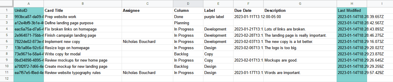
Next, click on the paint bucket in the toolbar, and pick the color you want to use.
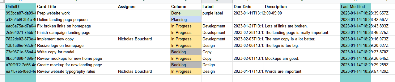
With the right colors, you can almost imitate a project management tool right in your spreadsheet.
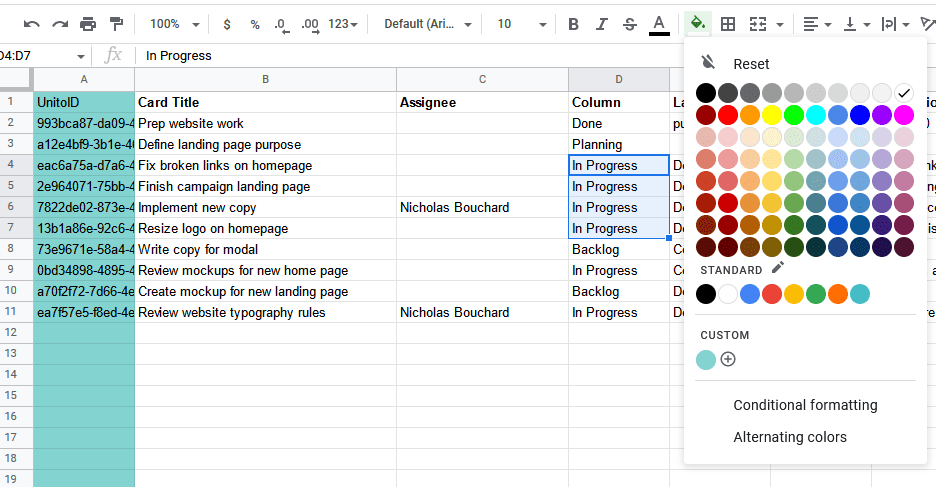
Using conditional formatting
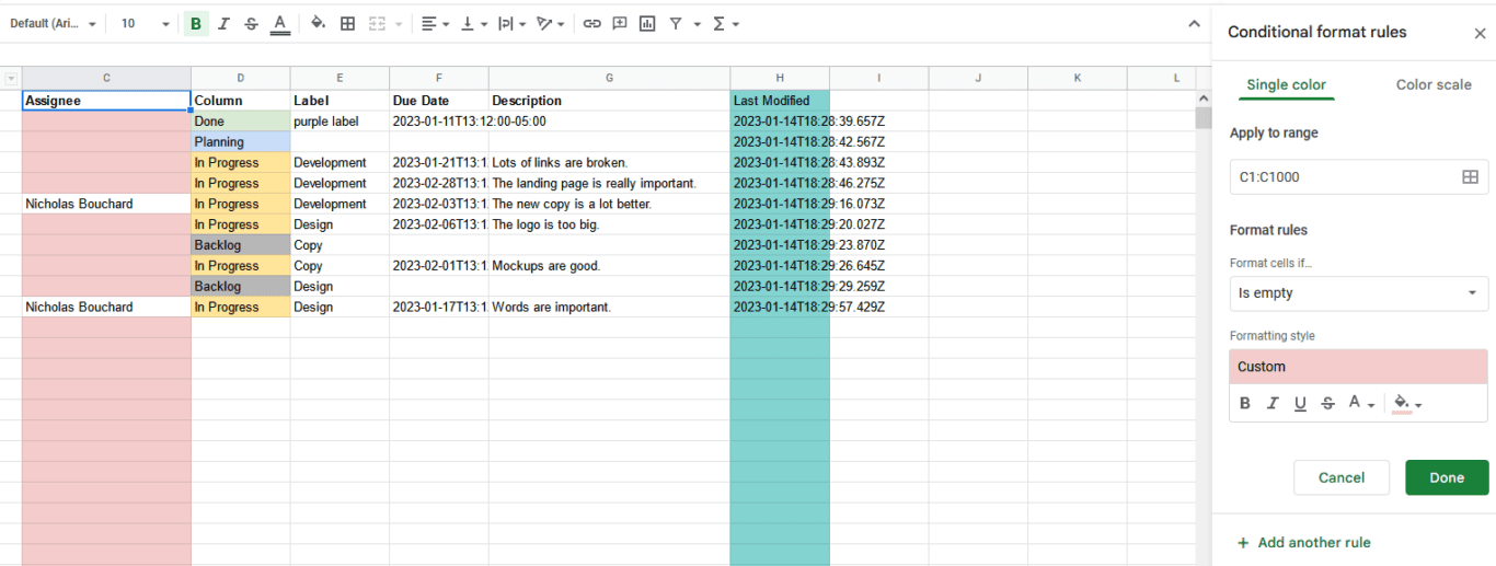
So you know how to add colors to your sheet, but did you know you could automatically format whole columns? You can use this to change the color of your cells when a certain value is present or missing. For example, let’s say you’re working with an export from Trello and you want to highlight all Trello cards that don’t have a member assigned to them.
First, you’ll want to select the column you want to format.
Next, you’ll want to hit the little arrow on your column’s header
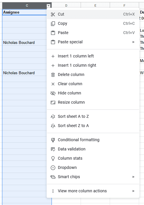
After that, hit Conditional formatting.
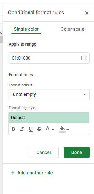
From there, all you need to do is pick an input in the Format cells if drop-down menu, with options that cover empty cells, cells that contain certain text, dates after a certain day, and more. After you’ve picked that input, you can use the Formatting style to change the cell’s color, bold the text in it, put it in italics, and more.
With the right formatting, you can make your reports sing. Here are a few ways you can use this in your spreadsheets:
- Highlight tasks that are past due or coming up soon, so you quickly identify project risks. Here’s a guide on doing this from How-To Geek.
- For spreadsheets reporting numbers — like hours worked or money spent — you can use this to highlight numbers above or below a specific threshold.
- You could replicate the task statuses you see in tools like Trello or Asana with color-coded formatting.
Want to learn more? Check out our deeper guide into conditional formatting.
Google Sheets tip #2: Create basic charts and sparklines
Having data in your spreadsheet is great, but you also need a way to represent it for everyone else. That’s where charts and sparklines come in. They’re easy to add, and they can completely transform your data.
Create charts
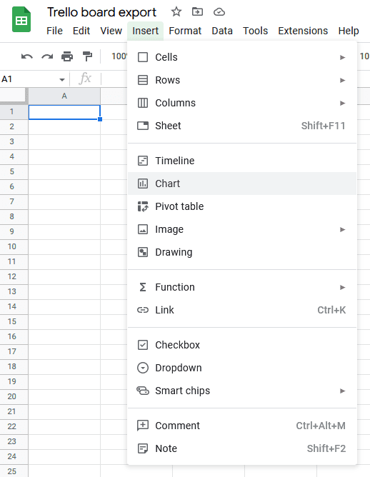
Google Sheets has built-in charts you can add to your report in just a few clicks. To start, just highlight the cells you want to include in your chart and hit the Chart button in your toolbar.
Use the chart editor to make changes as required.
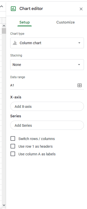
And that’s it! That’s all you need to do to add a chart to Google Sheets.
You can change the colors, font, and other visual elements of your chart to suit your needs — whether that’s making it more visually appealing or highlighting important data. To do that, just click on the chart and go to the Customize tab.
The data you export from your project management tool is text-based, which can be somewhat limiting with native Google Sheets charts. But you can still use simple pie and bar charts to highlight trends for single rows of data. For example, you could use a pie chart with data from an Assignees column to see how many tasks each assignee has.
Want to see what a project report chart looks like in Google Sheets? Check out this template.
Creating a sparkline
Sparklines are a great way to visualize data trends and patterns without taking up a huge chunk of your sheet. They’re best used to highlight number-based data and capture high-level trends. They’re easily shareable, make your data more readable, and allow you to quickly communicate important insights.
Adding a sparkline to your spreadsheet is super simple. Just pick the cell where you want to have your sparkline and type (or copy and paste) the following:
=SPARKLINE([FirstCell]:[SecondCell])Then, all you need to do is replace [FirstCell] with the data you want your sparkline to start with, and replace [SecondCell] with the data where your sparkline will end. You’ll get something that looks like this.


Google Sheets tips #3: Use filters to focus on specific data
Ever tried to check a report, only to find that there was so much data in it that it was only marginally useful? Or maybe you’re the one building reports and you’re getting the sense your coworkers don’t use them as much as they could? That’s where filters come in.
You can use filters to limit how much data is displayed in your reports, so you can surface actionable insights without overwhelming the reader.
Using Unito to filter data
When you use Unito to get your Trello data into a spreadsheet, you can use rules to filter out Trello cards you don’t need in Google Sheets. For example, you could filter out all cards with a specific label or a specific assignee. But because Google Sheets gives you the ability to filter this data natively, you can instead choose to sync all your Trello cards and filter them once they’re in Google Sheets.
Don’t have Unito yet? Check it out here.
To add a filter to your Google Sheet, just use this formula:
FILTER (range, condition 1)
You can also add more conditions to your filter, separating them with commas:
FILTER (range, condition 1, condition 2, condition 3)
The range input is where you specify the data that needs to be filtered (e.g. A2:B15). Conditions are the requirements you set for your data to show up (e.g. A2:A26 > 5).
You can learn more about using filters from Google’s support documentation.
Google Sheets tip #4: Use pivot tables to summarize and analyze data
Pivot tables are a great tool for grabbing data from your report, summarizing it, and creating specific, insightful views. They can group data by specific columns, calculate totals and averages, and create charts. Some can be just a few rows, while others are as large as the original spreadsheet. Here’s a great video guide to creating pivot tables.
In short, here’s how you can create a pivot table:
- Select the data you want to use.
- Click on Pivot table in the Data menu.
- In the Pivot table editor sidebar, choose the columns you want to use to group your data. You can add columns to the Rows and Columns sections to group data differently.
- In the Values section of the editor, choose the columns you want to get sums and averages for. You can also show the number of entries for each column.
- Customize your table as needed.
Google Sheets tip #5: Use data validation tools to prevent errors
Data validation rules let you control the data going into your spreadsheets to manage data entry and formatting errors. With a few clicks, you could set up a column so it only accepts valid date and time formats, a specific kind of content, or even dropdown options. Here’s how you can set up data validation rules in Google Sheets:
- Highlight the cells you want to add your rule to.
- Right-click and then click View more cell actions, followed by Data validation.
- Click + Add rule.
- Choose the criteria you want to set, like specific dates, checkboxes, dropdowns, and so on.
- Fill out the necessary fields.
It’s that simple!
Google Sheets tip #6: Learn your shortcuts
You’ll find the same shortcuts in Google Sheets that you’re used to in other tools, like Ctrl+C for copying, Ctrl+V for pasting, Ctrl+Z for undoing mistakes, and so on. But there are some shortcuts specific to Google Sheets that’ll make your life a lot easier. Here are just a few of them.
- Ctrl+R: Fill right
- Ctrl+D: Fill down
- Ctrl+Space: Select column
- Ctrl+; : Insert current date
- Ctrl+Shift+; : Insert current time
- Ctrl+Shift+H: Find and replace
- Alt+↑: Go to previous sheet
- Ctrl+F11: Add a new sheet
- Ctrl+Alt+9: Hide Row
- Ctrl+Alt+M: Insert comment
Google Sheets tip #7: Publish spreadsheet to web
Did you know you can use Google Sheets’s Publish to web feature to share a report without forcing anyone into Google Sheets? That’s right, you can share the contents of your spreadsheet with anyone, even if they don’t have a Google account. You can choose to share a whole sheet or only a piece of your data. You can publish your sheet as a webpage, a pdf, a csv, or even an Excel spreadsheet.
Here’s how it’s done.
Just go to the File menu, hit Share, then Publish to web.
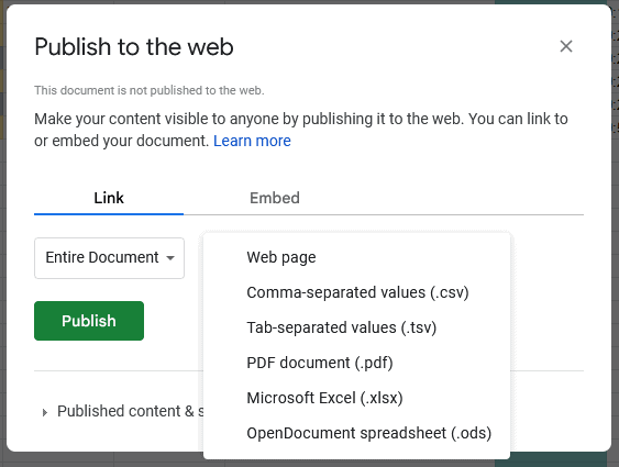
This gives you the ability to make your reports more visible — while preventing people from getting in and messing up your spreadsheet.
Export & Sync: The best way to get Trello data into Google Sheets
Manually exporting data from Trello means you’re working with outdated information the minute you hit export, and there’s always manual work involved in making sure it ends up where it needs to go. Most Trello Power-Ups that help with this don’t automate the process or keep your data fresh.
That’s where Export & Sync comes in.
Export & Sync is Unito’s latest Trello Power-Up and the fastest way to get Trello cards into Google Sheets — and keep everything up to date in both tools.
Get it from the Trello marketplace here and try it free for 14 days.
Google Sheets hacks #8: Use a template before you export data
Importing data into a blank spreadsheet means you’ll have to do a ton of manual work to clean things up. How do you avoid all that? By using a purpose-built template.
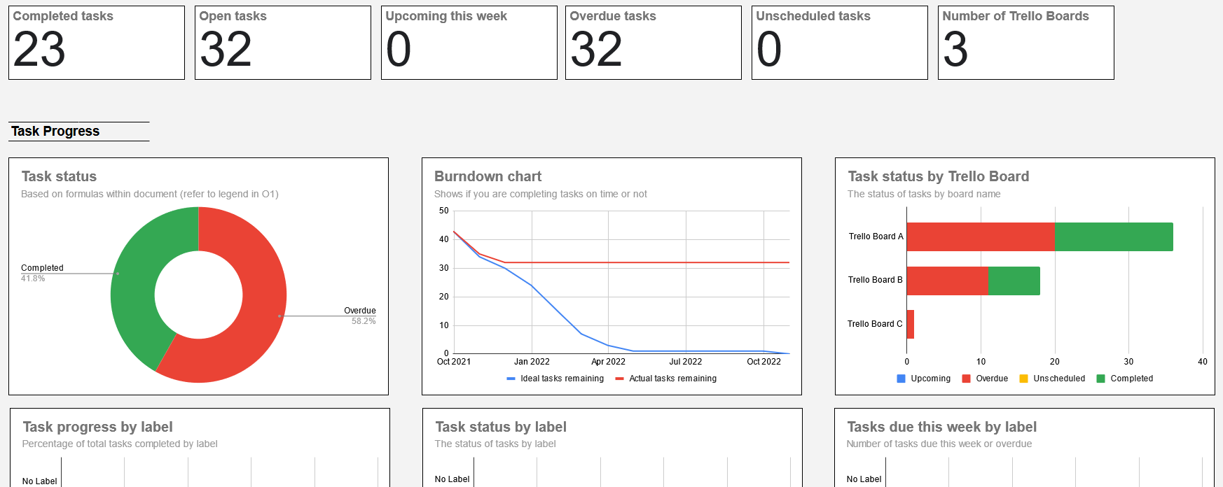
With most of these templates, you can send all your data into one tab of your spreadsheet — usually called something like “raw data” or “data dump” — and have that data automatically populate dashboards and charts. Here’s an example from Unito’s automated Google Sheets status report template.
Not sure where to find the right template? Check out these lists:
- Gantt chart templates for Google Sheets
- Templates for project management
- Templates for everything else
Google Sheets tip #9: Use integrations to import data and save time
Google Sheets often serves as a stopping point between tools, since most of the people on your team know how to use it. But manual data entry can create a lot of errors, and copying and pasting extensive data can eat up hours of work that would be more useful spent on other tasks.
So what do you do?
You use a platform like Unito.
Unito has some of the deepest two-way integrations for some of the most popular tools on the market, including Google Sheets, Excel, Asana, Jira, Trello, Airtable, and more. When you import data straight into Google Sheets from other tools with Unito, you don’t need to do nearly as much cleanup.
Get more out of your Google Sheets
When you import data into Google Sheets with Unito, you’re already ahead of people who still enter their data manually. But with these tips, you can turn your automated report into a true resource, and help the entire team move forward together.