
The 11 Best Reporting Tools for Teams and Businesses
Running a business without reporting is like driving a car with a blindfold on. You know the general direction you’re going in but everything else is a bit of a guess. This is where the right reporting tools come in handy.
Reporting tools let you convey large amounts of potentially complex information in an easy-to-read way. You’re able to ask big-picture questions, make hypotheses, and then gather the data needed to make decisions. Without reporting tools, you wouldn’t know whether your company’s new products are selling well, whether the sales team is hitting their targets, or whether customers are actually clicking the CTAs on your weekly emails.
In this post, we’ll explain the difference between reporting tools and business intelligence software, break down some of our favorite reporting tools, and help you decide which tool is best for your business.
Reporting tool vs. business intelligence platform
To understand the difference, it’s important to define both reporting tools and business intelligence tools.
Reporting tools gather data across different sources such as your social media impressions, sales, customer numbers, web traffic, and conversions, then turn this information into easy-to-read reports or visualizations (such as graphs and charts). Reporting tools provide a clear snapshot of what’s happening within a business at any given time.
On the other hand, business intelligence (BI) tools will gather, organize, and visualize data from various sources and present it in a way that helps you understand the why behind this information. A BI tool lets an organization see the bigger picture by investigating what’s driving its business operations.
While it’s important to understand the subtle difference between these two terms, it’s generally accepted that most “reporting tools” include aspects of BI software or vice versa.
In Unito’s Report on Reporting, 37% of respondents said they spent at least three hours a week on reporting. With the right tools, you can cut that time down to minutes. So you’d best make sure you have the right reporting tool for the job.
Spreadsheets: best legacy reporting tool
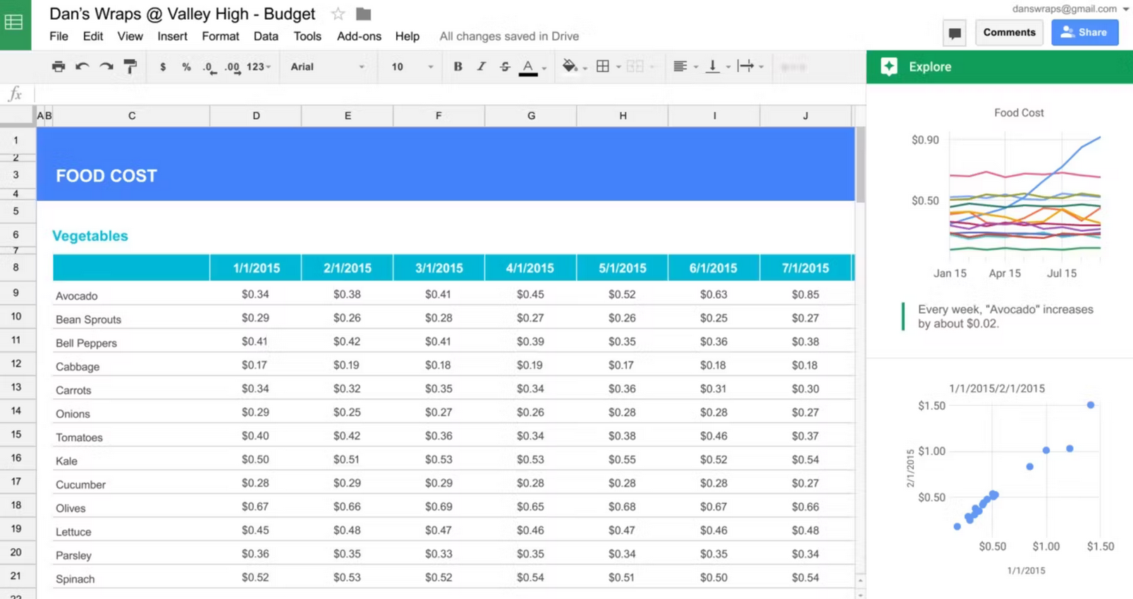
Despite the vast majority of dedicated reporting tools on the market, tons of organizations still use spreadsheets (either in Google Sheets or Microsoft Excel) for the majority of their reporting needs. With features from data validation to complex formulas and pivot tables, even casual users can quickly build detailed reports for all sorts of needs.
Both Google Sheets and Microsoft Excel are bundled into broader software suites, meaning that nearly every business has access to one of them. There are also a ton of integration solutions out there for these spreadsheets, meaning you can centralize information from multiple data sources without too much extra effort.
Pricing
Both Google Sheets and Microsoft Excel are part of their respective business suite, meaning that your organization is likely already paying for them. But, just in case you’re not, here’s what you can expect to pay for Google Workspace and Microsoft 365.
- Google Workspace: Between $6-$18 per user per month. You’ll also get access to Google Docs, Google Slides, Google Meet, and more.
- Microsoft 365: Between $6-$22 per user per month. On top of Excel, you’ll get access to Word, PowerPoint, Teams, and more.
Drawbacks
While you can start building reports in spreadsheets without much of a learning curve, you’ll always hit a wall at some point. Either you’ll start to waste a ton of time on manual data entry or you’ll start needing features that just aren’t available outside of dedicated reporting software. That means you’ll eventually need to upgrade, whether that means paying for an integration or extra reporting tools.
HubSpot: best reporting tool for customer-facing teams
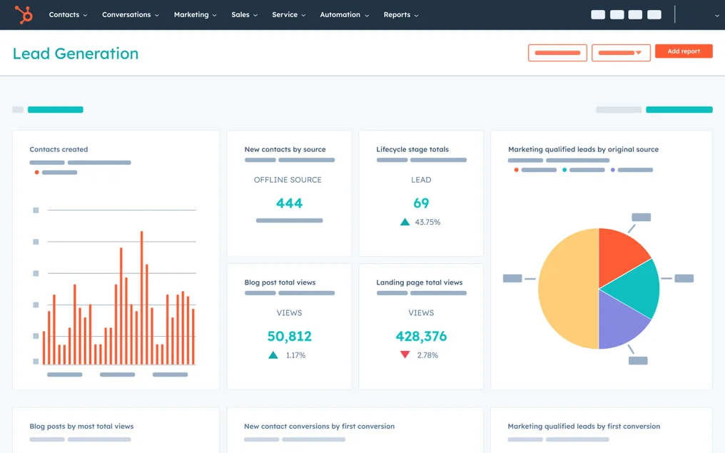
While you might be familiar with HubSpot — the all-in-one inbound marketing software — you might not know just how robust Hubspot’s integrated analytics and reporting tools are.
With HubSpot’s dashboard and reporting tool, you can track the entire customer journey from the first contact to closing the deal. If your business has multiple areas that need to be tracked, HubSpot gives you a single source for all of your marketing, website, sales, and service key performance indicators (KPIs). Plus, the multi-touch revenue attribution shows exactly which areas of the business are bringing in the most revenue, helping you decide where to concentrate resources in the future.
To make the process even more streamlined, you’re able to connect your CRM info and import data right into HubSpot. When you want to customize your HubSpot reporting experience even further, you can integrate any of your favorite apps available on the HubSpot App marketplace.
And with Unito’s HubSpot integration, you can also sync HubSpot tasks to any other tool in your stack, keeping everything updated without any extra work.
Pricing
Hubspot has multiple pricing options depending on the kind of plan you need (ie. Marketing, Sales, CMS, Customer Service, or Operations). The costs here range from $45 a month to $3200 a month.
Drawbacks
While a tool such as HubSpot can be invaluable to countless organizations, the cost can be prohibitive to some. Their free version doesn’t have a ton of features, so in order to get the most out of their reporting tools, you’ll need to sign up for one of their plans.
The Zoho BI Platform
The Zoho BI Platform — which includes both Zoho Analytics and Zoho DataPrep — is both business intelligence software and a reporting tool that offers informed forecasting, data alerts, and automated reports. With an intuitive UI, Zoho Analytics works with plain and simple language so you don’t need to worry about getting too technical. For example, you could simply search “this month’s biggest sales in Toronto” and Zoho Analytics will know what to do.
DataPrep uses machine learning to create and manage your business’s data (pre-analysis) — Data Stories — letting you embed your reports right into presentations, websites, and Zia Zoho, the conversational AI that lets you use natural language queries. This AI also provides insights from your reports to help you make better business decisions in the future. Not only that, but Zia Zoho can run and analyze different hypothetical situations so you can prepare your business for a number of possibilities and crises. Plus, Zoho Analytics can be integrated with more than 250 other tools,like HubSpot and Zendesk.
Pricing
Zoho BI Platform is available in either a cloud or on-premises version. The cloud version is $8 a month per user or $96 a year per user. The on-premises version is $30 a month per user or $360 a year per user.
Drawbacks
Even though Zoho Analytics is highly automated, you’ll probably need to use or hire someone with technical knowledge to generate some more complex reports.
Whatagraph: best reporting tool for marketers
Whatagraph is a reporting tool aimed at marketing professionals who need to monitor and visualize campaign results and data. With Whatagraph, you can create tailored and customizable reports with less work. In fact, Whatagraph promises that you can build a report in 10 minutes or less using one of their customizable templates.
Some other Whatagraph features include automatic report delivery, a report stylizer that lets you add branded colors and logos, collaboration tools that let you share and edit reports with others on your team, custom data transfers from Google Sheets and public API integrations, and multiple channel monitoring that lets you see the performance of multiple campaigns and channels all in one place.
Pricing
You can try Whatagraph free for 7 days. After that, you can choose from three different plans.
- The Professional plan: $119 a month annually (or $139 a month when billed quarterly) and includes one user, 15 data sources, and Live Chat Support
- The Premium plan: $279 a month annually (or $319 a month when billed quarterly), and includes five users, 50 data sources, a dedicated account manager, custom branding, and multisource reporting
- The Growth plan: $699 a month annually (or $779 a month when billed quarterly) and includes custom users and data sources, a dedicated account manager, custom branding, multisource reporting, and public API
Drawbacks
While Whatagraph is a comprehensive and valuable tool for any marketing professional, it seems that some users find it to be a bit buggy on occasion (based on a number of reviews).
Tableau
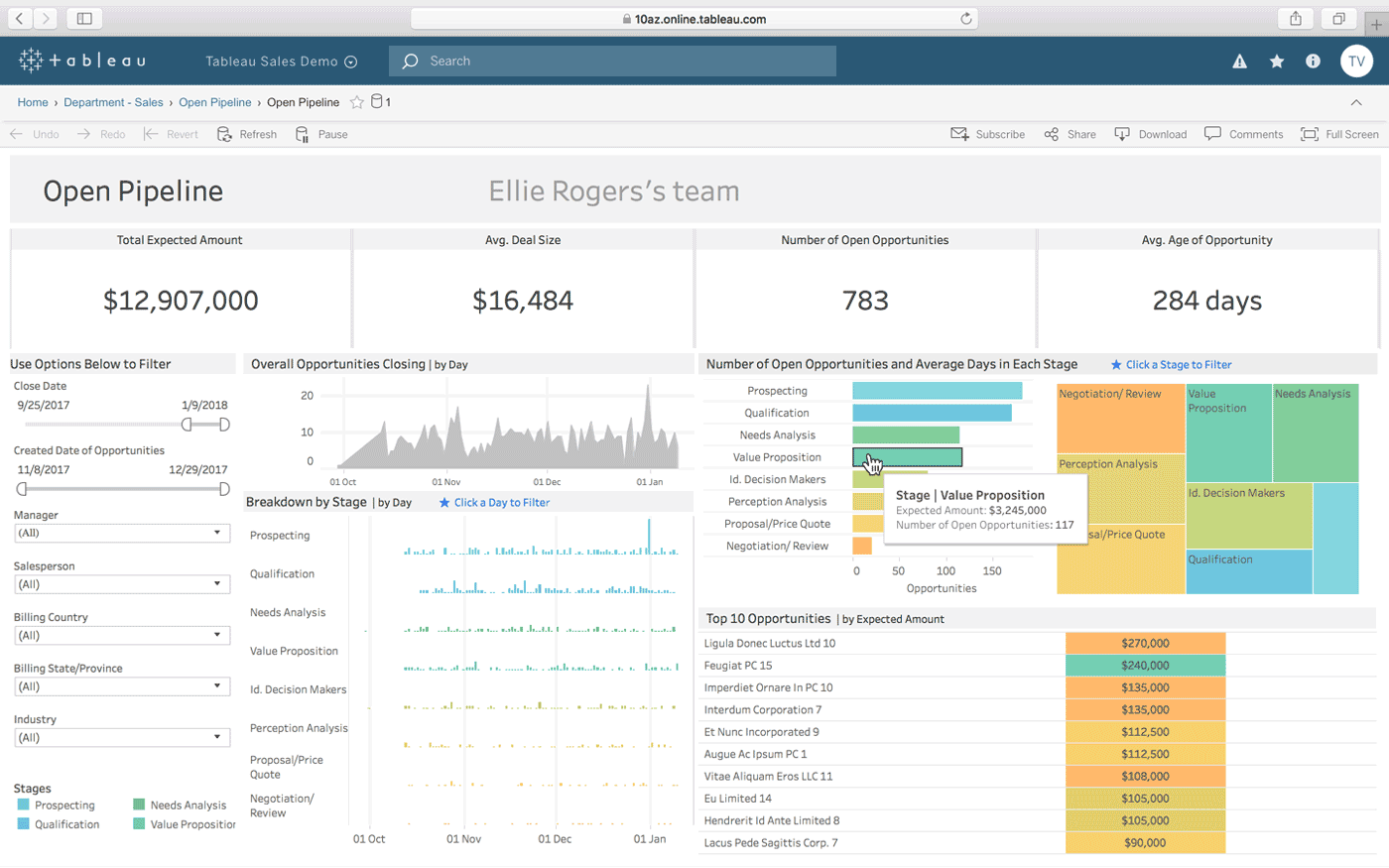
Widely recognized as one of the top reporting tools available, Tableau represents your data in worksheets and dashboards so you can easily recognize patterns and forecast results. Tableau is user-friendly, with no complex or technical knowledge needed before getting started. It’s used by everyone from charitable organizations to schools and global corporations.
If you’re looking for a secure end-to-end analytics tool for your business data, Tableau is a solid choice. Different options within the Tableau Platform can suit a wide variety of needs. These include:
- Tableau Prep, which sorts and cleans your data before its analyzed;
- Tableau Desktop, which offers unlimited data exploration through an intuitive interface, drag and drop capability and AI-driven statistical modeling;
- Tableau Online, secure and scalable cloud-based analytics; and
- Tableau Server (an on-premises analytics tool).
Tableau’s analytics can be tailored to your team and their specific needs. These platforms work for everyone from artists and creatives to researchers and data scientists, with a focus on accessible analytics and reporting.
Pricing
Due to Tableau’s customizable plans, pricing varies depending on the plan and add-ons you require. For example, the individual Tableau Creator plan is $70 per month, per user, and includes access to Tableau Desktop, Tableau Prep Builder, and one Creator license of Tableau Server or Tableau Online. However, if someone on your team just needed to view dashboards and data visualizations, the Viewer Plan is $12 a month per user.
Drawbacks
One of the main drawbacks of Tableau is the need for thorough data cleaning. You can’t simply throw your data in there and receive insights or the visualizations you need. That said, their Tableau Prep feature combines, shapes, and cleans your data so it’s ready to be analyzed as quickly as possible.
Octoboard: best reporting tool for templates
Octoboard is a cloud-based tool that simplifies the entire reporting progress. With a number of different dashboards available, you’re able to see detailed analytics such as social media engagement and activity, email open rates, and website statistics — all from one place. Octoboard will collect your data from the different cloud-based applications your team uses so you can identify trends and share insights as easily as possible.
If you don’t have time to create a report from scratch, or are simply looking for a new and more dynamic way of organizing your information, Octoboard has more than 350 pre-made report templates for your use.
With Octoboard, you can also schedule and automate reports, invite staff and clients to your dashboards, host dashboards or reports on your website, and integrate with more than 70 other web applications.
Pricing
Depending on your plan and requirements, Octoboard can cost about $10 to $100 per month. Their pricing structure is shown in Euros, so keep the exchange rate in mind when calculating your budget.
Drawbacks
According to a few accounts, the data Octoboard provides occasionally shows minor discrepancies when compared to the original Google or Facebook data.
Databox: best reporting tool for KPIs
If your team is heavily focused on KPIs, Databox could be the reporting tool for you. It provides a single interface where you can view your team’s KPIs and allows you to generate reports based on this data. Built for everyone from CEOs to marketers, Databox connects all of your important data in one place and lets you track the performance of not only your organization as a whole, but on a team and individual level.
Some key features of Databox include Scorecards, which keep you updated on your most important goals and KPIs, notifications for lackluster performance, multi-platform capabilities, a Dashboard Designer that lets you build your own dashboards, integrations with more than 70 other tools, and Data Calculations which combine data from multiple sources to calculate metrics, conversion rates and more — no spreadsheets required.
Pricing
Databox offers a “Free-forever” plan that includes three Data Sources, all of their standard features, and more than 60 Databox Integrations. If you’re looking for something a little more robust, their Starter plan comes in at $72 per month for up to five users, their Professional plan is $135 a month for 25 users, and their Performer plan is $231 a month for unlimited users.
Drawbacks
Some users describe a lower-than-average customer service response time, and say the live support channel can be glitchy at times.
Wrike: best reporting tool for project managers
If you’re a project manager, chances are you’re already familiar with Wrike’s dynamic reporting tools. Wrike’s project reporting tools promise to provide “360° visibility across every aspect of your teams’ work” with real-time progress tracking. Here, you’re able to track, measure, and share metrics related to your team’s productivity as well as overall project progress. You can quickly and easily see whether your team’s output is meeting expectations, and pivot any resources as necessary before they become an even bigger issue.
With a variety of data visualization options, the information you need can be presented in a way that makes the most sense for you and your team. Not every graph layout or chart format works for every team or client, so that flexibility here is definitely added value.
While this reporting tool is embedded in the Wrike system, you’re able to import data and info from more than 50 different digital marketing tools. Not only that, but you can fully customize your dashboard for advanced reporting functionality with countless analytical widget add-ons.
And since Wrike is one of Unito’s integrations, you can sync it with any other tool in your stack so everything’s kept up to date no matter what work tools your teams use.
Pricing
Wrike’s reporting tool is included in a Wrike subscription. A subscription to Wrike costs $0 (for beginners), $9.80 per user per month for their Professional account, $24.80 per user per month for a Business plan, and higher when you’re looking at an Enterprise Plan.
Drawbacks
The main drawback of Wrike’s reporting tool is that it requires a Wrike account to use. It is also mainly geared towards project managers, so the features may not be as useful when it comes to professionals in other industries or roles.
Microsoft Power BI: best reporting tool for security
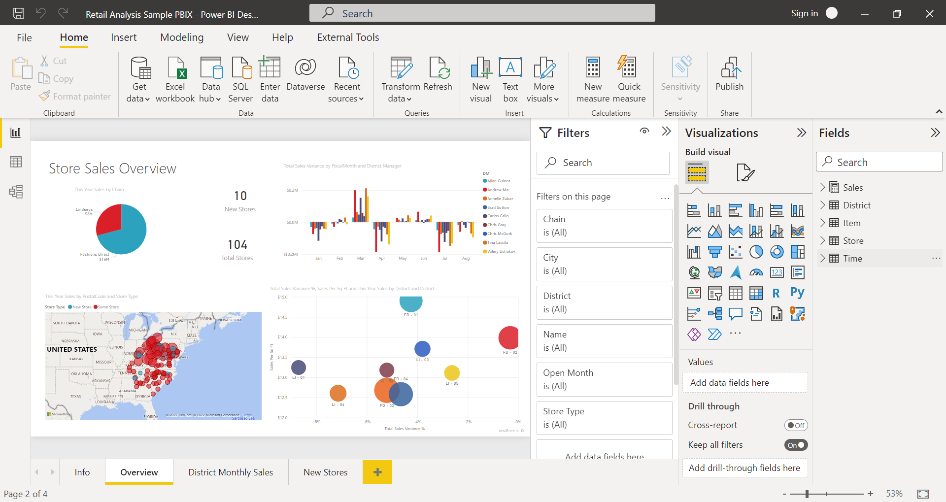
Microsoft’s Power BI is a comprehensive and secure collection of self-serve business intelligence and reporting tools specifically for large and scaling enterprises. Power BI lets users gather, analyze, visualize, and share data and insights through a secure platform.
Power BI connects to hundreds of data sources, whether on-premise or in the cloud. These include Excel, popular social media networks, Salesforce, Google Analytics, and many more. You can then prepare and analyze data using AI-based tools and create live, interactive visuals. This means you can easily glean greater insight and focus on areas of interest of a particular report, whether you’re the creator or viewer.
What sets Power BI apart from some other reporting and business intelligence tools is the high level of security included. With end-to-end data protection, your information is secure even when shared outside of your business.
Pricing
If you’re just starting out with reporting, you can download Power Bi’s free version to self-publish reports and dashboards. However, if you need to do anything more complex (including connecting other data sources) you’ll need to upgrade to a paid plan. Power BI’s Pro Plan (included with Microsoft 365 E5) is $12.80 per user per month, while their Premium Plan is $25.60 per user per month or $6,393.60 per organization per month. As with most of the reporting tools available, pricing for Microsoft Power BI depends on your specific needs.
Drawbacks
Although Power BI is noted as being user-friendly, this is the case only if you’re just using it to import your data and create reports. As Power BI consists of a full suite of multiple tools, you may need to learn and master their other applications such as Power BI Report Server and Power BI Gateway, which can be a bit trickier depending on your degree of tech literacy.
ThoughtSpot: best simple reporting tool
When first using ThoughtSpot, you’ll immediately notice the modern design and easy-to-use interface. Promising to make analytics and reporting as simple as using your favorite mobile app, ThoughtSpot lets you turn insights into action — in real-time.
Their reporting tool includes a number of features, such as Search IQ (their search engine) that indexes and analyzes complex data across hundreds of sources, and Spot IQ (their AI engine) which automatically surfaces any insights it finds within your data. You’re able to simply ask a question or enter a term into Search IQ, much like you would on Google or another search engine, and instantly get answers. They also offer custom portals, interactive data apps, integrations with SaaS apps like Salesforce, and connectivity with tools like the Google Suite and Slack.
If your team of developers want to create automated insights and custom actions, ThoughtSpot offers powerful APIs just for this. Instead of having to wait for data experts or other external contractors, ThoughtSpot empowers your team with instant insights they can gather using simple language and their natural curiosity.
Pricing
After a free trial, you can contact ThoughtSpot for custom pricing for your organization. Their pricing isn’t publicly available, but note that both of their paid subscriptions include access for an unlimited amount of users.
Drawbacks
While ThoughtSpot is great for finding and sourcing insights, they could offer more comprehensive options when it comes to visualizations and dashboard customization.
Holistics.io: best reporting tool for technical roles
Geared towards those in more technical roles, such as scientists, data analysts, engineers, and even doctors, Holistics.io is a self-service business intelligence and reporting tool that promises to cut your time spent on data organization and analysis in half.
Within Holistics.io, teams can define and curate their metrics, build reports and charts with self-serve analytics, and present data to stakeholders and executives through email or Slack.
The interactive dashboard lets you monitor and analyze key metrics with smart filters, and then transform this information into visualizations such as heat maps, metric sheets, and conversion funnels.
Pricing
After a free 14-day trial, Holistics.io offers a few different subscription options. Their Entry plan is $100 a month for up to 10 users and up to 50 reports, their Standard plan is $250 for up to 20 users and 150 reports, and their Professional plan is $500 a month for up to 20 users and unlimited reports. If you require even more functionality and users, you can contact Holistic.io’s team for information and pricing regarding their Enterprise plan.
Drawbacks
As Holistics.io is built specifically for more technical users, those without these skills will most likely find the tool challenging to use. For example, you need to set up your own SQL (the programming language, not “sales qualified lead”) database before getting started.
Get Unito’s Report on Reporting

The reporting process is absolutely essential for your business. But have you ever felt like it’s more difficult than it should be? We surveyed 150 knowledge workers from various industries, asking them about their reporting workflows, the tools they use, and more. Some of the key takeaways you’ll get from this report include:
- The top three issues encountered in all reporting workflows.
- How much time the average knowledge worker sinks into reporting every week.
- How the tools you’re using can make reporting more difficult.
- Why so many people still have to build their reports all by themselves.
- How the amount of reports needed on a daily basis can be overwhelming for just about anyone.
You can get the full breakdown of their answers — and our analysis — in Unito’s Report on Reporting. Get it for free below.
What’s the best reporting tool for your team?
The right data can simplify and streamline the decision-making process for businesses of any size. With the reporting tools listed above, you can ensure your organization is sourcing, analyzing, and gaining insights into your data as effectively as possible.