
Data Interpretation 101: How Project Managers Can Use Data To Make Better Decisions
Data is essential. It helps people make better decisions. It helps companies avoid terrible decisions. It gives you the insight you need to steer your team in the right direction. But how do you turn a pile of numbers — or a bunch of user interviews — into something you can actually use? You use a process called data interpretation.
Here’s a guide to data interpretation for project managers, marketers, developers, and anyone else who depends on data.
What is data?
Data, at its core, is information. It comes in all shapes, across all kinds of sources, but it’s always information. A statement can be data, if used as evidence to make a point. Numbers are most often what you’ll think of when you hear the term “data.” Anything from percentages to measurements and counts can be data. As a project manager, examples of data points you encounter include revenue, time spent on a task, overdue tasks, and user-based metrics like signups and churn.
Quantitative vs. Qualitative data
All data fall into one of these two categories. Quantitative data is any data that can be represented by a number. Revenue, customer churn, and the number of signups are all examples of quantitative data.
In contrast, qualitative data is usually represented with words. Statements from user interviews and feedback from employees are both examples of qualitative data.
As a project manager, your data interpretation skills will have to cover both types of data.
The 7-step data interpretation process
Now that you know what data is, let’s dive into how you can use it in your project management work. This process assumes you’re responsible for both getting the data together and interpreting it. If you already have your data in hand, you can start with step 4.
Data interpretation step 1: Pick the right data
Before you start getting data together, you need to know what you’re looking for. If you’re dealing with quantitative data, you’ll want to make sure you have the right metrics. Even a project dedicated to something very specific — like reducing churn — could have its success measured with all sorts of metrics.
For qualitative data interpretation, you’ll need to make sure you’re getting the right information. That means making your questions easy to understand, asking the right questions, and asking the right amount of questions, too.
Data interpretation step 2: Data collection
Once you know what kind of data you need to collect, it’s time to go out and actually get it. Depending on what you’re gathering, that might be as simple as asking a data specialist for access to their tools or as complex as planning a series of user interviews.
No matter how your data collection happens, standardize everything. With numbers, make sure they’re all referring to the same thing, in the same way, even if they’re scattered across many tools. With words, make sure you’re asking the same questions every time. Otherwise, you’ll be creating problems for yourself further down the road.
Data interpretation step 3: Process data
Now that you have a pile of data, it’s time to make sense of it. For quantitative data, it can mean putting it in a table or building an interface with a tool like Airtable to better represent what you’re working with.
With qualitative data, you’ll need to do something called coding. No, don’t worry, you don’t have to be a programmer to do this. All it means is identifying themes and relationships across bits of data and applying them to what you’ve collected. That way, you go from a bunch of random statements to trends and categories.
Data interpretation step 4: Clean up your data
All your data is processed and coded, so it’s time to dive in, right?
Wrong.
No matter how careful you are when collecting and processing data, you’re guaranteed to run into some weirdness. With quantitative data, you might get corrupted entries when you’re exporting from multiple tools, for example.
With qualitative data, your transcription tool of choice might have confused synergy with clergy, or you might have to edit out some…interesting answers.
So it’s important that you take the time to clean up your data.
Data interpretation step 5: Explore your results
Alright, now that everything’s cleaned up, it’s time to actually dive in and see what you’re working with. This is when you start looking for patterns, anomalies, outliers, and otherwise comparing your results against your initial hypothesis.
There are a ton of methods you can use to explore data, from counting unique values to checking the frequency of specific results and clustering similar results.
Whatever you choose, this is when you go through and start making sense of your data. This is what most people think of when they hear the term “data interpretation.”
Data interpretation step 6: Turn your data into a chart or model
Now that you’ve done most of the hard work that comes with data interpretation, it’s time to make your data palatable for everyone else. That might mean loading it into a tool everyone uses — like Google Sheets or Airtable — or even boiling it down to a simple write-up.
The method you pick has to be easy to consume for your target audience. If you’re sharing data with the data team, you can go all out. If you’re dealing with stakeholders from different teams, you’re going to have to simplify things.
Data interpretation step 7: Get insights
What’s the point of collecting all this data if you don’t do anything with it? A big part of data interpretation is turning a spreadsheet or a bunch of interviews into action items that’ll help propel your project forward.
You can do this alone or with your team. Try running a brainstorming session where you present your data and ask for everyone’s help coming up with new initiatives.
No matter how you do it, it’s important to actually use the data you’ve spent all this time working on.
Data interpretation mistakes to watch out for
Now that you know how data interpretation works, it’s time to cover some of the pitfalls that pop up throughout this process. With these in mind, you can avoid common mistakes project managers run into when working with data.
Ignoring bias
A bias is anything that pushes your interpretation of data away from rationality towards pre-conceived notions or problematic patterns. There are a ton of cognitive biases, but here are a few you’re likely to run into:
- Confirmation bias: The tendency to go out looking for data that confirms something you already believe rather than interpreting data from a more neutral position.
- False consensus: Assuming that people agree with you more than they actually do.
- Base rate fallacy: Ignoring more general information in favor of specific information you think is more relevant to whatever you’re exploring.
- Contrast effect: A change in your perception of a specific piece of data when contrasted against other types of data.
When interpreting data, you can look up common examples of bias to try and keep a more objective view of what you’re working with.
Mistaking correlation for causation
This is a classic mistake. While looking through your data, you notice that when Variable A goes up, Variable B goes up as well. “Ah-hah!” you think to yourself. “Variable A’s increase causes an increase in Variable B!”
Congratulations, you just confused correlation with causation. Don’t worry, it happens to everyone.
Correlation describes a relationship between two variables that both move (in one way or another), whereas causation implies that one variable directly causes the other.
For example, say you’re working on reducing customer churn, and you’re analyzing the behavior of churned customers. You might notice that churned customers are responding less to messages from your automated support bot, and that they’re interacting with your product less before they churn. This is an example of correlation. Not responding to a chatbot doesn’t cause your customers to interact with your product less, but you can establish a correlative relationship between the two variables.
Using a small sample size
When determining the data you’re going to collect, you need to make sure the sample you’re selecting is large enough to give you actionable insights. If your sample size is too small, the takeaways from your data might seem solid, but they’re not actually representative of broader trends.
So how do you make sure you’ve picked a sample that’s the right size?
While data specialists use complex processes to calculate this, project managers can use these basic rules from tools4dev.org:
- Go no lower than 100. If the population you’re trying to get data for is smaller than that, you’ll need to include them all in your data.
- Shoot for a maximum of 10% of your overall population, as long as that 10% isn’t over 1,000.
- Pick a number between the minimum and maximum, based on your resources.
Dashboards: the layman’s key for data interpretation
At this point, you might have realized that data interpretation is really complicated. If you’re a project manager who needs to work with data regularly, you might be getting to the point of giving up.
After all, the data you’re working with is often scattered across multiple tools, and you don’t have time to constantly hop back and forth between them to collect it. Especially when you have to report on progress multiple times a month.
That’s why Unito created a template you can use to build automated dashboards that collect data from your project management tools and lay it out for you in a way that’s easy to interpret.
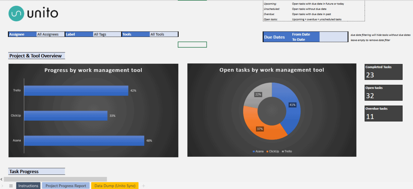
This template — available both for Google Sheets and Microsoft Excel — automatically pulls data from your project management tools to give you actionable insights in minutes.
You’ll know each team member’s workload, get a burndown chart that’ll help keep you on track, and more.
How does it work? With a little help from Unito.
Unito is a no-code 2-way integration platform with some of the deepest options for customization for the most popular tools on the market, including ServiceNow, Azure DevOps, Asana, Excel, Google Sheets, Jira, GitHub, and more. With a Unito flow, you can pull tasks from your project management tool into a spreadsheet, where they’ll stay updated in real time. No more copying and pasting, no more cleaning up piles of data.
The best part? You can try it for 14 days for free, no credit card required.
The numbers don’t lie (except when they do)
Data is essential, and with how widespread SaaS tools have become, it’s not just data scientists that need to know how to use it. But with the right process — and the right tools — data interpretation doesn’t have to feel like you’re climbing a mountain, in sub-zero temperatures, in sandals.