The Best To-Do List and Note-Taking Apps
The mighty to-do list is one of the oldest methods of organization, counting everyone from Leonardo da Vinci to John Lennon among its adherents. Simple and effective, they’ve successfully transitioned from notepads to computer screens, with countless apps competing to be your tool of choice. While there’s definitely a place for more feature-heavy project management apps like Trello or Asana, the best to-do list apps stick to the basics: they provide a place to keep track of daily tasks, usually in a checklist form.
With a new to-do list app seemingly launching every day, choosing the right tool has become a task all its own. With that in mind, we tested out a number of to-do list apps to find out which ones are actually worth the download.
Let’s take a look at the best to-do list apps — their features, design, pricing, and biggest drawbacks.
We also threw in a few note-taking apps that you can use for building to-do lists, too.
Todoist
Features
Perhaps the most well-known app on our list, Todoist promises to let you “start each day feeling calm and in-control.” Once you sign-up (with a Google email address, Facebook account, or other email address), you’re able to access your Todoist list on your desktop or laptop and through the mobile app.
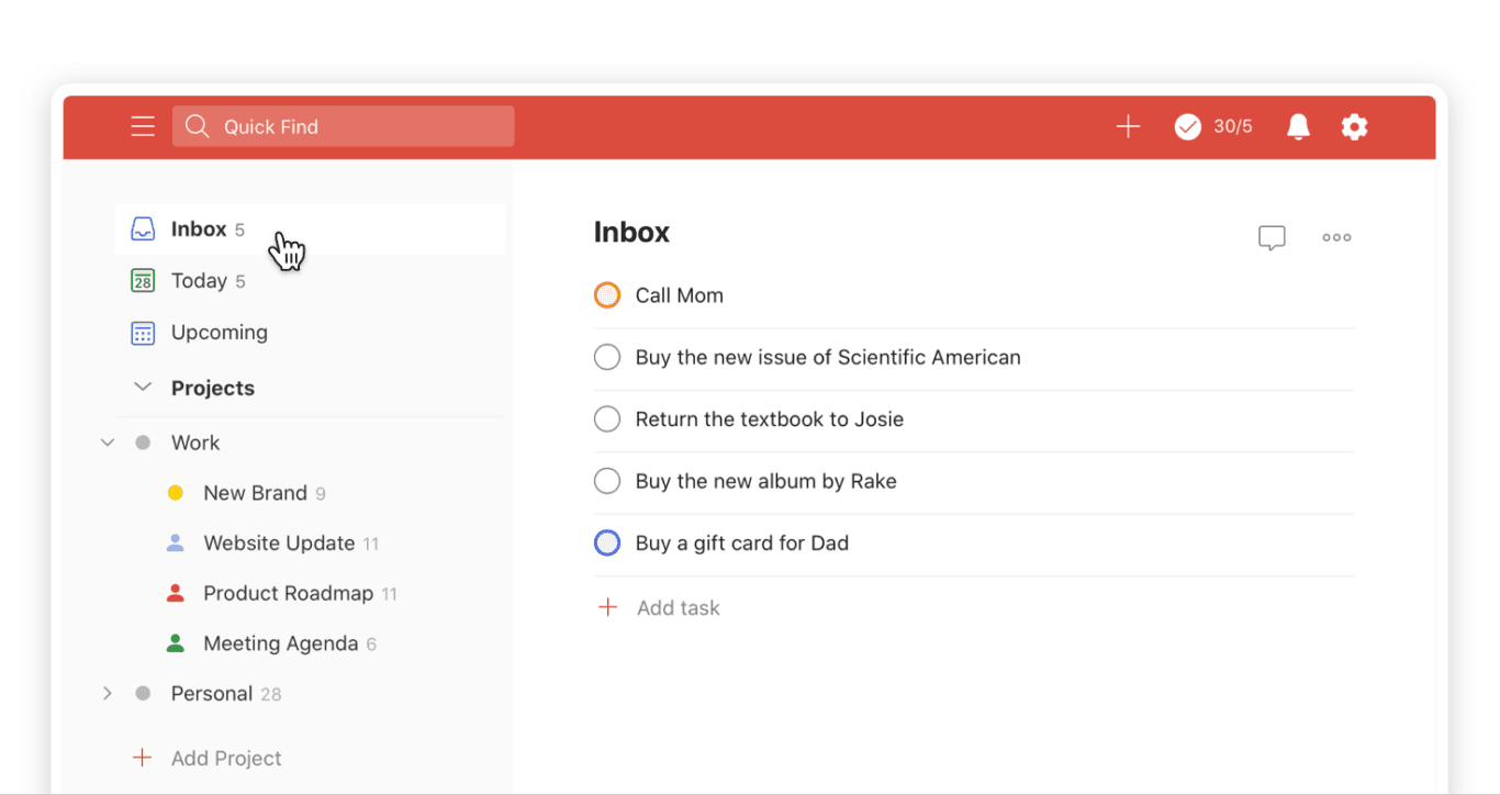
With Todoist, I had a general overview of everything going on in my professional and personal life — all in one place. If I needed to quickly check what was going on each day, I didn’t have to deal with switching between multiple windows and apps. When I had to double-check an appointment time en route, I could easily see it right when I opened the app. Available on more than ten apps and plugins, it’s easy to sync your to-do list across all of your devices.
You can quickly add tasks with the “Quick Add” feature, set recurring due dates, label certain tasks as “Favorites” to keep them easily accessible, and set priorities to highlight your day’s most pressing tasks. You’re also able to easily collaborate with others thanks to the sharing function. For example, when I was working on a blog post with a coworker, I was able to share my project to-do list so that we could ensure we were aligned on the timeline and scope.
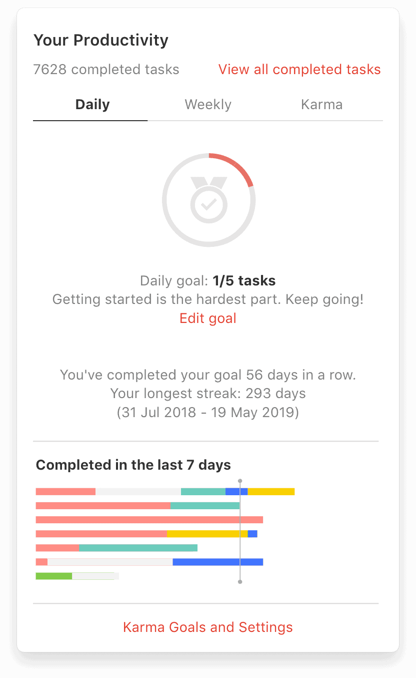
If you’re a visual person like me, you’ll enjoy the “Todoist Karma” and “Productivity Visualizations” the app provides. With Todoist Karma, you get points for completing your tasks and maintaining productivity streaks. Turning your dreaded to-do list into a game? Genius. With Productivity visualizations, you’ll get a color-coded chart showing your daily and monthly task and project progress. For those weeks when you don’t feel as if you’ve accomplished anything, this visual representation is quite the motivation.
Design
While I wouldn’t say Todoist has the most cutting-edge aesthetic (due to the number of different colors and graphics), there’s definitely nothing offensive about how it looks. The design never gets in the way of the performance. If you want to enhance the look of your experience you can choose a different color scheme, and add color labels to your projects.
Pricing
The basic version of Todoist is free, but you can upgrade to Todoist Premium for $47.99 or $5.49 a month. The premium version includes unlimited reminders, the ability to add comments and files to your tasks, productivity trends, automatic backups, and more.
Biggest drawback
As the basic version of Todoist is all I need, it would be nice if the Todoist Premium features were hidden. It was irritating to click on a homepage item like ‘Labels’ only to see a popup explaining that this is a premium feature.
WorkFlowy
Features
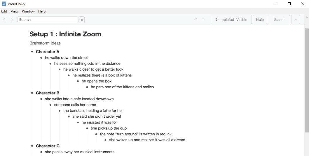
While it looks sparse at first glance, the WorkFlowy app can be quite powerful once set up.
Workflowy is easy to figure out and is cross-platform friendly, so you can use it on your laptop/desktop or your phone. The mobile app isn’t exactly the easiest to use however. It’s more like “what you see on the desktop browser shrunken down.”
As you start creating your to-do list, you’ll immediately notice the bullet format. The single dots represent single items, and larger grey dots represent outline levels and tasks that have hidden subtasks within them. All of the tasks you create can be marked as complete, have notes added to them, exported, duplicated, or deleted simply by clicking on the associated bullet point. If you need to delete or mark a number of tasks as complete, Workflowy has a handy bulk action function that can save you precious time. Not quite into the order of your list? Easily drag and drop to reorganize to your liking.
For example, I used WorkFlowy to help plan a trip so had “Organize Trip” as a larger task or project. Then within that task I had my smaller to-do list bullet items like book flights, research accomodation, and ask for restaurant recommendations. I was just writing tasks down as I thought of them, but as I got closer to my trip I was able to drag and drop tasks to reorder according to priority. Plus, with the handy hashtag feature, I was able to label any associated tasks as #travel so I could search for them later.
Design
The WorkFlowy interface is extremely minimal, and requires very little in the form of onboarding. There was a small learning curve but, after spending a few minutes getting the hang of the different features, it was smooth sailing.
Pricing
The basic version of WorkFlowy is free, but you can upgrade to get unlimited lists (where free users are limited to 500), daily Dropbox backups, and priority support for $5 a month with WorkFlowy Pro. You get a week of free WorkFlowy Pro when you first sign up, which is a great opportunity to see if you need the extra features.
Biggest drawback
I wish that WorkFlowy had some sort of time management capability. Their cascading to-do list format is great, but I’m someone who needs my tasks to have deadlines. While you can just manually write dates next to each project or task, the lack of time and date fields, as well as time tracking functionality, is a huge drawback.
MinimaList
Features
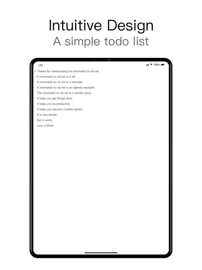
When I first opened MinimaList, I didn’t see how something so simple would actually make my life easier. Boy, was I wrong. An unassuming interface quickly gives way to all that MinimaList can do. Plus, it looks really, really good doing it.
When you open the app, you’ll see extremely simple instructions on how to get started. What sets MinimaList apart from the other to-do list apps I tested, is the use of the phone’s swiping and movement to control features. You pull down to add an item to your to-do list, swipe right to mark as done, swipe left to delete, and pull upward for more. You can also use a pinching movement to see all of your separate lists in one spot, and drag tasks with your finger or stylus to rearrange them.
One of the key features of MinimaList is the ‘tap to enter focus mode’ feature. When you tap on any of your to-do list tasks, a Pomodoro timer appears. You can set desired time limits for “focus time,” turn on the app’s white noise and ambient sounds, and customize your experience through a few different options.
Design
MinimaList appealed to me initially thanks to its modern design. I love the black and white look, the Sans Serif font, and the extremely simple overall look. I was also surprised by how much I liked the swiping and tapping functions instead of the usual buttons. With this simple change, I found myself much more inclined to use the app, as that tiny time-saving that comes with swiping and tapping made my life just a little bit easier.
Pricing
The regular version is free, but you can upgrade to Premium for access to extra features for $0.99 cents a month or $5.99USD a year.
Biggest drawback
As someone who works on a laptop all day and then uses my phone the rest of the time, I found the biggest drawback to be the current lack of a desktop version. I would think of items to add to my to-do list while at my desk, and have to switch gears and get onto my phone to do them. Besides being a bit annoying, constantly picking up your phone is not a great look while you’re at work.
MyLifeOrganized
Features
I heard about MyLifeOrganized (known as MLO to its fans) from a coworker, so I was excited to try it out for myself. As soon as I opened the app, it showed me a brief slideshow walking me through the key features. These include: Outline, which lets you organize your projects and break down larger tasks, and To-Do, which is a list of actionable tasks the app automatically generates based on your Outline.
You can also set different notification types based on your preferences, create custom views with only the details you need, and create folders to help you stay organized.
As someone who was looking for a simple to-do list app, I appreciated that I could customize the main side menu bar to include, or hide, exactly what I needed.
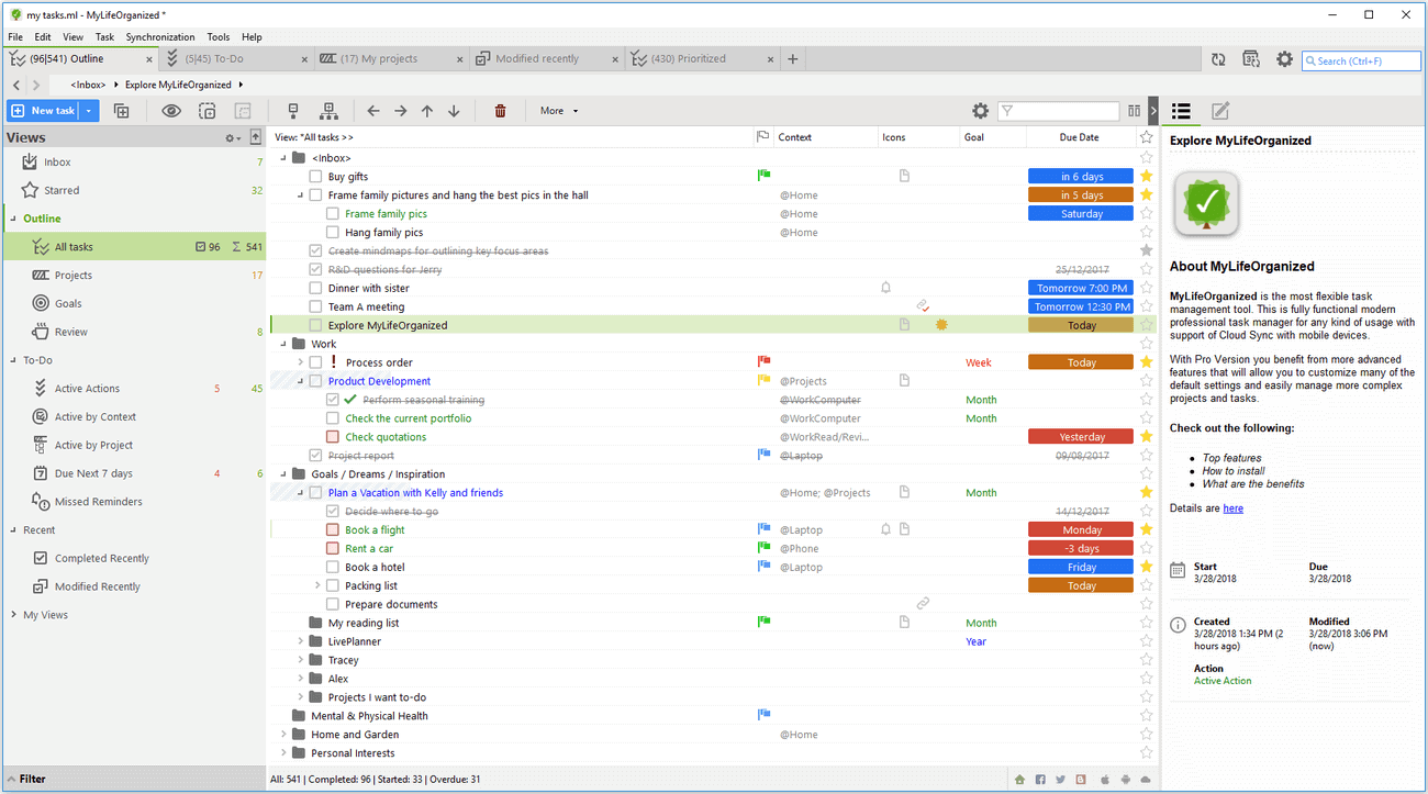
Because I was using MLO as both a professional and personal to-do list, I found the ‘Contexts’ feature handy and intuitive. Contexts are MLO’s version of hashtags, and work as a filing system. If, like me, you like to see an overview of all of your tasks in one spot, you can add Contexts like @Work or @Home to differentiate between your task types. You can then show only the @Work or @Home labeled to-do list items depending on what you need to see.
MLO offers tons of other label options, such as @Errands, @WaitingFor, or @OfficeCalls, plus the ability to add your own Context categories. For a basic to-do list (my personal preference), I found the @Work and @Home labels to be enough.
Design
I wouldn’t say that MLO is especially chic when it comes to its design. If you’re someone who needs the incentive of an aesthetically-pleasing interface, it might not be for you. Visual design aside, I would say that MLO has the most dynamic platform capabilities and support community. There are countless YouTube tutorials and online groups of MLO devotees if you’re looking to get the most out of the app.
Pricing
The basic iOS and Android versions are free — and all I needed for a simple to-do list app. If you’re looking for something with more features and capabilities, however, the Professional version is $29.99 for mobile and $59.95 for Windows. There is also a Standard Windows version that is $49.95. MLO’s pricing page provides a further breakdown of features and costs.
Biggest drawback
Honestly, the biggest drawback with MyLifeOrganized is the price. It’s not so much that you have to pay for the Premium version, it’s that if you want to access your to-do list on your desktop, you have to pay the $49.95 to do so. Since I just needed a basic to-do list, this seemed like a lot of money to just be able to access it on a desktop. Plus, they don’t yet offer a version for Mac computers.
Any.do
Features
The first thing you need to know about Any.do is that it appears in Apple’s App Store as “Calendar & Planner by Any.do.” Because of this, I had a bit of trouble finding the much-recommended app.
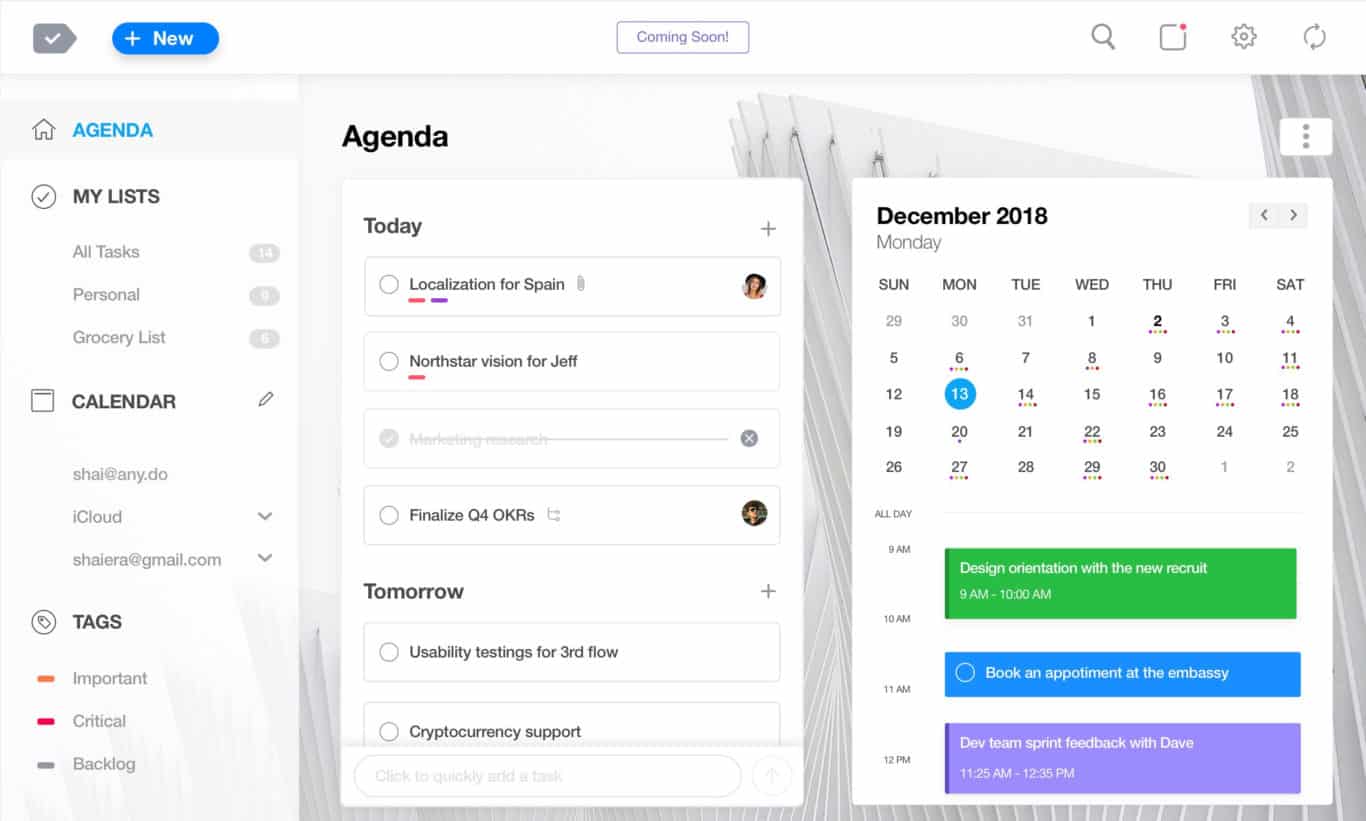
Once I got over this first hurdle, I was impressed with Any.do’s features. Upon opening the app, you’re given the option to view in a calendar or list view. I chose list view to start with, but was able to easily toggle between the two when I wanted. When I switched to calendar view, I was pleasantly surprised to see that my phone’s calendar events had automatically been imported into the Any.do calendar. The app will integrate with your Google and Outlook calendars as well, so this is handy for those of us who are constantly working across various devices and platforms.
With Any.do, you can organize multiple to-do lists, reorganize these lists with drag and drop capabilities, set priorities and categories, and add subtasks, notes, and attachments to your items. You can set due dates and reminders to keep track of your progress, and quickly see any current or upcoming tasks. If you need to collaborate on anything, Any.do makes it super easy to share your lists and tasks with contacts via email.
One of the most impressive features of Any.do is actually the “grocery list of the future.” This function lets me input items I need, while automatically organizing them into categories such as ‘Beauty and Personal Care’, ‘Eggs and Dairy,’ and ‘Frozen’. While I had previously just been using my regular old Notes app on my iPhone, I’ll definitely be switching to Any.do for my grocery lists from now on. No more wandering from one end of the grocery store to the other. I can now see everything I need from each department and make my shopping trips much more efficient. Even better? I can easily share the list with anyone else so they can have access as well. And maybe even pick up milk on their way home.
Design
Any.do has a very well-thought out design and user experience. The simple interface and aesthetic plus the drag and drop capabilities and easy onboarding process creates a pleasant experience for the user.
The desktop version looks even more minimal than the mobile version, which could be a bonus or drawback, depending on your preferences. Since I tend to have a ton of tabs open and an occasionally cluttered desktop, I like having my to-do list look as clean as possible.
Pricing
The basic version is free for both mobile and desktop, while the Premium version is $5.99 for one month, $4.49/month for six months, and $2.99/month for 12 months. Premium features include recurring tasks, customized themes, a WhatsApp integration, mobile location reminders, and an unlimited daily planner.
Biggest drawback
Like other apps, the free version does have its limitations. If you rely on location-based reminders for certain things (such as work projects or personal errands), you’ll have to upgrade to the Premium version. Even if you simply want color labels added to your tasks or subtasks, you’ll have to pay.
Notion
Features
Notion is a work management tool users can use to track progress on projects, build meeting calendars, create knowledge bases, and — of course — build to-do lists. This is done by using Notion’s “blocks” to build out pages for specific purposes. Think of it like using a website builder; you pick the pieces you want and move them around to get what you want.
Though it’s a work management tool first, Notion’s flexibility means you can use it to track tasks in a ton of ways. Fan of Kanban boards? Want a simple checklist? Need to integrate your to-do list with a project management methodology? You can do it all using Notion.
One of the best parts of using Notion is its templates. Notion’s strong community means there are a ton of people looking to use the tool for the same use case. That makes your initial setup a snap, and you can find new ways to track your to-dos you might not have thought of before.
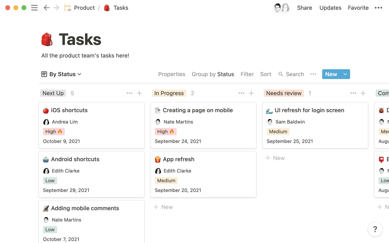
Templates aren’t the only way you can use Notion to create a to-do list. With Notion’s to-do list block, you can easily add a list of tasks to any other page in just a few clicks.
Design
Notion’s design is simple and efficient, with tons of white space. But the real strength of its design is just how much it enables. What’s beneath the hood is so much more important than what you see on any given page.
Pricing
Notion is completely free for personal users, with limitations on how many people you can share your pages with and file size for attachments. Get a Personal Pro plan at $4 a month to get rid of these limitations. Team plans are $8 per member, per month, and custom Enterprise plans are also available.
Biggest drawback
Notion’s flexibility is a bit of a double-edged sword when compared to dedicated to-do list apps. While you technically can build things like time tracking and task tagging into Notion, it’s not something you get out of the box. If you want a to-do list that can become a springboard for a whole project or be integrated into your work management tool, Notion is a great choice. But if you want a dedicated to-do list app with more robust features, you might want to look somewhere else.
Pro tip: Using Notion for project management
Notion isn’t just a great to-do list app; it’s also a great project management platform. Because it’s so flexible, you can use it to track project progress, deliverables, and more, all without being an official project manager. But before you start using it for that, you need to make sure you have all your ducks in a row. That means getting a crash course on how it works, getting buy-in from stakeholders, and more.
Here’s what you need to start
TeuxDeux
Features
TeuxDeux is an app that aims to be a beautiful way to keep track of what you need to do. It works a bit like a cross between a calendar and a to-do list. Tasks can be assigned to specific days, allowing you to track your work across the week. Incomplete tasks automatically roll over from one day to the next, so you don’t have to stay on top of due dates; you just need to do the work.
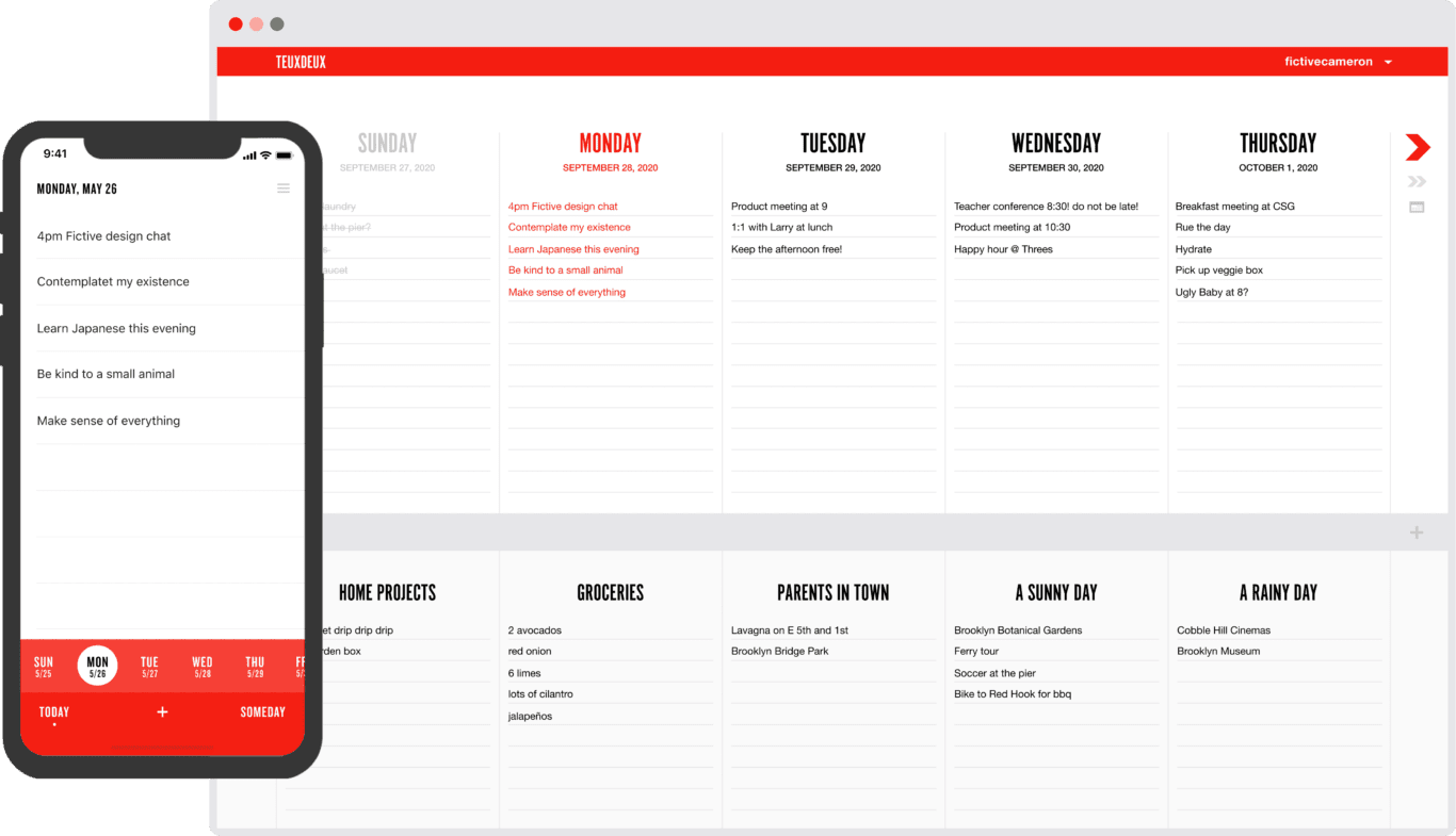
This weekly view isn’t the only way you can track your to-dos. When you scroll down in the app, you’ll find a spot where you can add additional lists. This lets you organize your tasks by project, theme, and so on. Heard about a new book at work? Throw it into a “To-read” list, and you’ll have it at your fingertips whenever you finish your current read.
TeuxDeux can sync across all your devices, be that through an Android or iOS app or the web app. That means you can add a to-do from anywhere you work and always have it with you.
Design
TeuxDeux’s homepage claims they want to keep things as simple as paper, and there’s truth to that. It’s easy to look at the app and imagine the lined notebook pages these to-do lists sprang from. Being able to change the app’s main colour is a nice touch.
Pricing
TeuxDeux offers a 30-day trial. You can still use the app for free after that, but you won’t be able to do it from all your devices. To sync your to-dos across platforms, you’ll need to subscribe to TeuxDeux’s monthly plan ($3/month) or yearly plan ($2/month).
Biggest drawback
If you want to keep things simple — and cheap — TeuxDeux might be the to-do list app for you. That said, it lacks Notion’s flexibility and the advanced features of other apps on this list. Depending on your needs, simplicity can be the app’s ultimate strength or an unfortunate weakness.
Google Tasks
Features
This is Google’s entry in the to-do list app ring. Track to-dos, add subtasks and get more done on any device, from mobile to desktop. Want an app that integrates seamlessly with other Google products? This might be the tool for you.
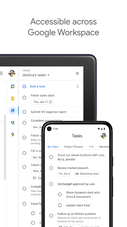
Google Task’s main feature is its integration with Google Calendar and Gmail. Going through your inbox and find something that needs to get done? You can do that right from the email by clicking on “Add to Tasks.” Check your to-do list and you’ll find the task there, ready to be worked on.
The Calendar integration means you can see your to-dos laid out by due date among your meetings. This makes planning out your day much simpler, and you always have your most important work top of mind. When you open the Tasks app, you can reorganize your work, adding details and subtasks.
Design
Ever used a Google product? Then you know what to expect here.
Pricing
Google Tasks is completely free, and it’s included with every Google Workspace plan.
Biggest drawback
You need to be using the Google Workspace suite to get the most out of this app. Without integrations with Gmail and Calendar, this app can feel pretty barebones. You don’t get time-tracking, tagging, timers, or anything but simple task-tracking.
Evernote
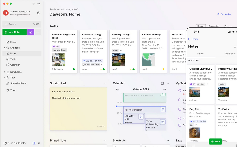
Evernote is one of the most popular note-taking apps out there, and for good reason! It’s versatile, powerful, and designed to work for all kinds of note-takers, whether you’re a student, filmmaker, or engineer.
Within Evernote, you organize your notes into virtual “notebooks,” then group those notebooks into stacks. You also can tag the notes to further organize them (think of them like color-coded sticky tabs).
Evernote can support nearly any type of content you throw at it like PDFs, audio, video, PowerPoints, and web clippings. Thanks to its character recognition capabilities, nearly all that content is searchable — even text in an image!
Evernote works for Mac and Windows, with a variety of apps available for various devices. It will sync across devices on those systems, too.
Pricing
While Evernote does offer a free plan, it’s a bit limited; you can only sync across two devices, and you can’t download notes to use offline.
Evernote’s Personal plan will run you $7.99/month, and will allow 10GB of offline storage every month and sync across two devices. The Professional plan is a little more expensive at $9.99, but you get twice the storage and more capability.
Biggest Drawbacks
If you’re looking for a free (or cheap) note-taking app, you will want to look elsewhere. Also, Evernote doesn’t integrate with Office 365.
Finally, like Notion, Evernote might just be too powerful for some people. If you’re looking for something super-simple (with a price to match), there are other note-taking apps that will be a better fit.
Microsoft OneNote
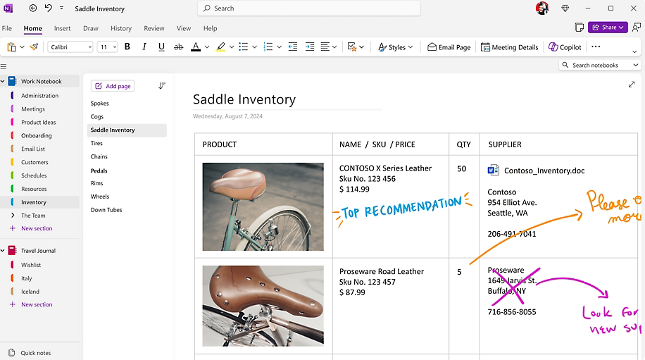
OneNote is the obvious note-taking app choice for die-hard Microsoft Office lovers. Since it’s part of the Microsoft ecosystem, it integrates natively with other Microsoft apps like Word and Excel. Similarly to Evernote, you’ll organize your work into virtual notebooks, and you can also color-code and label them for easy organization.
In addition to typing up your notes, you can write them using a stylus and tablet, or even scan notes written on pen and paper, the old-fashioned way. You can also easily search your notes, across many different content and file types.
As you can probably tell, there are a lot of parallels between Evernote and OneNote — and some key differences. Unlike EverNote, OneNote is free except for the cost of storage, but it’s also a little more flexible. Within your virtual notebooks, the pages are pretty much a blank canvas! Type up some notes, drop in an image, and even add a few doodles, all on the same page.
Pricing
As we mentioned, OneNote doesn’t have any paid tiers — all the features, including unlimited device syncing, are included. It does come with 5GB of free OneDrive storage, but if you’re saving tons of notes or large files, you’ll likely need more than that.
Upgrading isn’t expensive. You can get an extra 100GB of OneDrive space for just $1.99/month.
Biggest Drawbacks
Unfortunately, organizing your notes might be tricky in OneNote — their tagging and sorting capabilities are pretty limited. Also, some users find the interface to be clunky and unintuitive, although if you’re used to Microsoft apps, you likely won’t have that problem.
And, of course, OneNote makes the most sense if you’re already comfortable in Microsoft’s online environment. If you’re a Google, Linux, or Apple person, you’ll probably prefer something that feels a little more native to those systems.
Bear
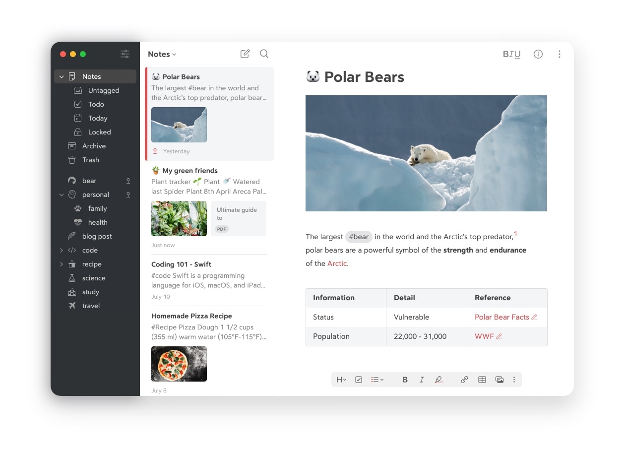
Bear is an affordable, intuitive note-taking app that’s great for iOS users. In addition to taking notes by typing, you can code, thanks to support for multiple programming languages. You can even draw if you’re an Apple Pencil user. Bear uses iCloud to sync across devices and is available as an app for Mac, iPhone, and iPad. You can use hashtags to organize and search through your notes.
Bear has a clean, beautiful interface, and users also love its Focus mode to help eliminate distractions. You can format your text as you type thanks to the text-to-HTML conversion tool Markdown and add images right into your notes — very few apps offer both these capabilities together!
Pricing
Bear’s free version includes many of the app’s useful features. For $1.49/month or $14.99/year, you’ll get more syncing, more export options, support for more file types, and more themes and editing tools.
Biggest Drawbacks
This one’s for Apple users only, with apps for Mac, iPhone, and iPad. If you’re a Windows person, it won’t work for you.
Also, Bear’s organizational powers aren’t quite as robust as other note-taking apps on the market. If you’re looking to create nested subfolders galore, you might want to look elsewhere.
Apple Notes
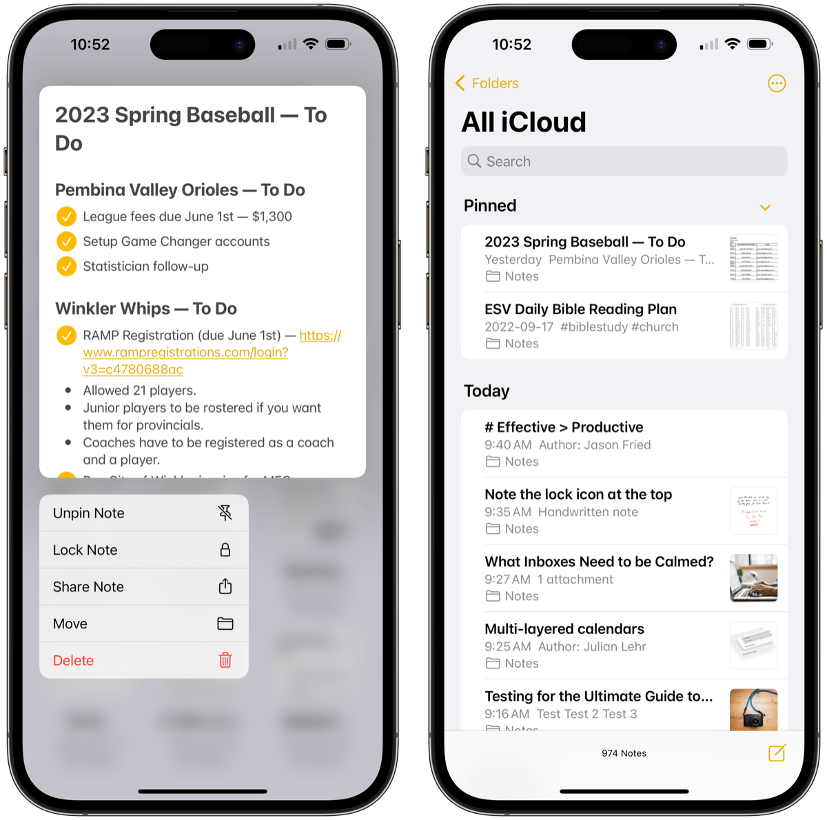
Apple Notes is one of the simplest, most user-friendly note-taking apps and comes included with every Apple device. In fact, if you have an iPhone, you’ve likely used it already! Many people use this familiar app to write down shopping lists, reminders, and random thoughts.
But Notes is much more powerful than it might seem at first. You can’t tag your notes, but you can create plenty of folders and subfolders for tidy organization. The app can also handle checklists, tables, images, or even scanned documents, most of which are easily searchable.
Of course, Apple Notes is meant for Apple devices. But if you need your notes on a PC or Chromebook, you can also access them through your browser.
Pricing
Similar to OneNote, Apple Notes is free — you’ll just need to pay for iCloud storage. You get 5GB free, and extra space starts at $0.99/month for 50GB.
Biggest Drawbacks
Obviously, Apple Notes is iOS-centric. Also, it’s definitely not as sophisticated as some of the other apps on the list. But depending on your needs, that might be a good thing instead of a dealbreaker.
Google Keep
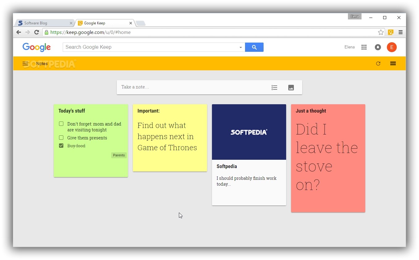
Think of Google Keep as a home for all those ideas, revelations, and tidbits that float through your mind during the course of the day. The app is designed like a digital, super-flexible version of sticky notes — multiple small, adaptable blocks, each of which can hold one idea.
You can use these sticky notes to hold a checklist, reminder, photos, or even voice memos (which the app will transcribe into text automatically).
It’s a simple system, but where it really shines is in how well it integrates with Google’s other apps — for example, you can turn a Google Calendar reminder into a note, or invite other people to collaborate on a note via Gmail. You can also color-code your notes, and pin anything super-important to the top of your page.
Overall, if you’re an Android user who needs to remember stuff (and who doesn’t?), Google Keep is an app you’ll never want to be without.
Pricing
Google Keep is free, and since it’s intended for small, simple ideas and reminders, it’s unlikely that it will use all your storage. But if you do need to upgrade, you can buy 100GB of Google Drive storage for just $1.99/month.
Biggest Drawbacks
As we mentioned, Google Keep is simple — it’s not intended for long, complicated notes and projects. You also won’t really be able to organize your notes beyond color-coding and tagging them.
Ulysses
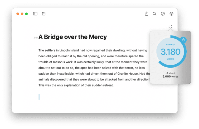
Like Bear, Ulysses is an Apple-specific note-taking app with a great interface. But unlike Bear, Ulysses is meant for writers — it’s especially ideal for long-form writing like articles, or even books! It’s powerful and flexible enough to handle the research, drafting, and editing stages of your process.
Ulysses comes with a Focus mode to help you avoid pesky distractions, but even its regular interface is designed to be clean and simple, getting out of your way so you can focus on the task at hand.
It also has great organizational power. You can sort notes in many different ways — such as by when you created or modified them — and create folders that nest inside each other hierarchically.
You can save and sync your work using iCloud, and use Markdown to edit and format your writing. When you’re finished, export your work as a .PDF, .doc, HTML, or even an ebook — however you like to get your words out into the world!
Pricing
While Ulysses does offer a free trial, the actual product doesn’t come cheap. The app will cost you $5/month, or $49.99 for the year. If you need a powerful writing tool to help you get those words down on digital paper, you might find it’s well worth the cost!
However, if you’re a student, Ulysses does offer some seriously discounted rates, albeit for six-month plans.
Biggest Drawbacks
Right now, Ulysses is only for Apple users — and it doesn’t sound like that’s changing anytime soon. And if you’re looking for something geared towards coding or team collaboration, Bear or Notion might be more your style.
Otherwise, this is a well-rounded, powerful note-taking app with few downsides!
Which is the best to-do list app for your needs?
With the number of available options growing every day, it can be hard to choose the best to-do list app for your needs. Hopefully, this breakdown helps you pick a tool to get started with. And when you do choose? Well, that’s one task to check off of your list.

