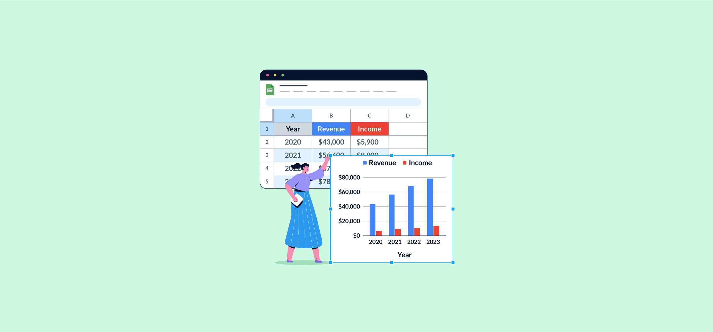
How to Create Simple Charts and Sparklines in Google Sheets
Staring at rows of data and trying to manifest useful insights can be challenging. Analyzing patterns and comparing data to find trends is essential but not always intuitive. Thankfully, there are simpler ways to break down this information in a way that’s easier to understand and share with your team.
In this article, you’ll learn how to create Google Sheets charts and how to use sparklines to help highlight trends.
How to create a chart in Google Sheets
Step 1: Prepare and format your data
Ensure all your data is organized correctly in rows and columns, with appropriate labels or headings as needed.
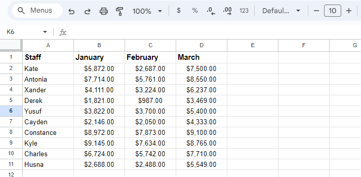
For this article, we’ll use the following data as an example, analyzing staff members and their total sales in gross profit throughout the first three months of the year (Q1).
Step 2: Insert your chart
Start by highlighting all the rows and columns of data that you want represented in your chart. For this example, that’s A1:D11. Then, under “Insert” in the top menu, select “Chart” and you’ll see the following chart editor pop up.
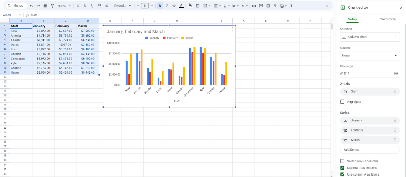
This is what we’ll be using to design and present our charts.
Step 3: Customize and edit your chart to suit your needs
Google Sheets will default to a column chart (what you see in the screenshot above) but there are a lot of different ways you can present your data. First, let’s break down the basics.
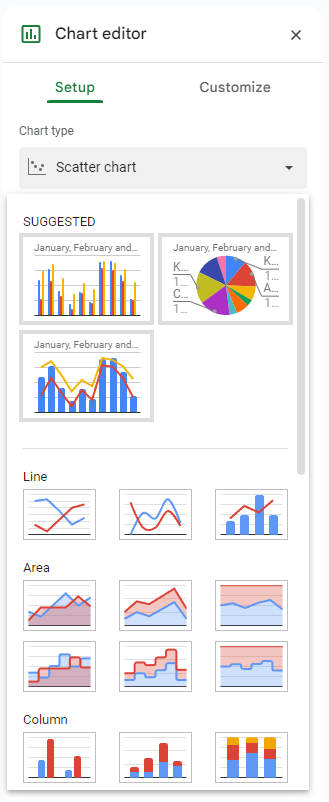
Under the “Setup” tab in the chart editor you can pick your chart type: column chart, pie chart, line chart, stacked charts, the list goes on. Play around with some different visuals to see what you like best, and what makes sense given what you’re presenting.
If you stick with the standard column chart, “Stacking” will change how the bars appear. This option doesn’t exist for every type of chart.
Under “Setup” you can also edit your data range, change your X- or Y-axis, and aggregate data a couple different ways. You can also switch the way your rows and columns are presented for a different view, like this:
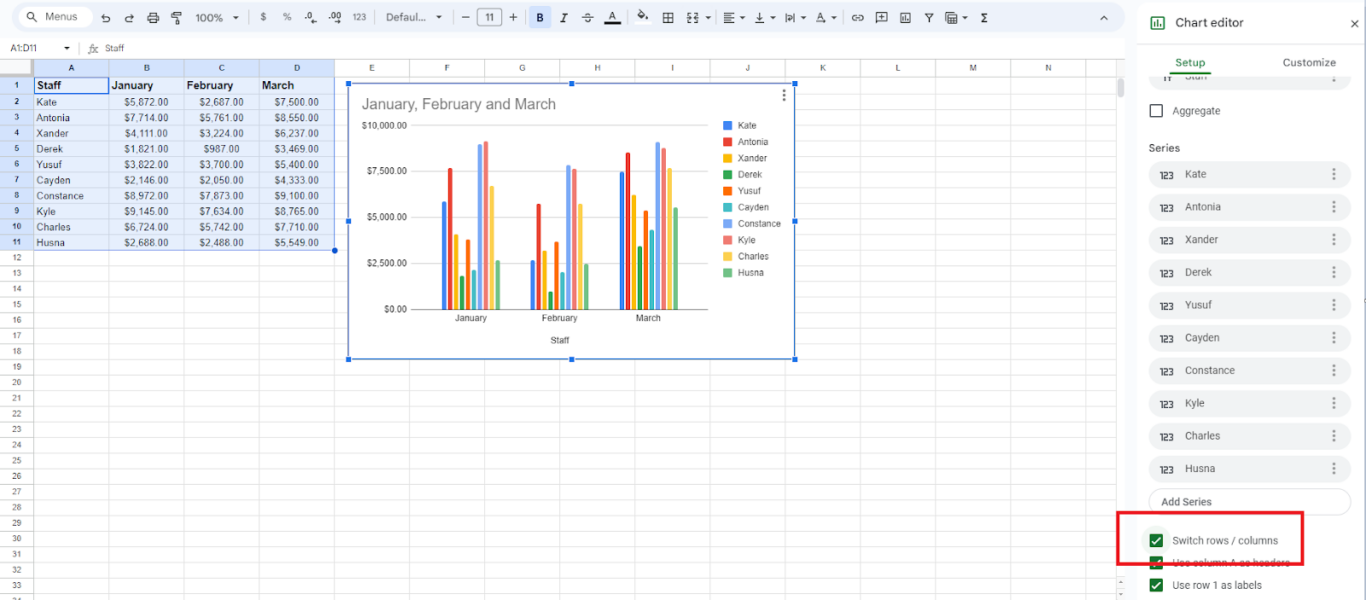
This example is the exact same column chart we shared previously, but we selected “Switch rows/columns” for a different view. How everything is presented will change based on your specific needs.
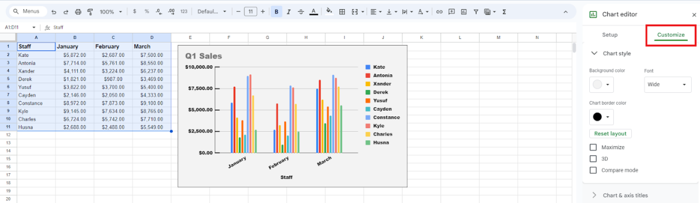
Under the “Customize” tab in the chart editor, you can play around with how it looks visually. There are options to change the font, rename the chart, add background and border colours, include gridlines, and more.
Here’s what we did with ours (again, it’s the same chart as the first example):
You could spend hours customizing your charts if you really wanted to, but we suggest keeping things simple. This will save you time and ensure your chats are quick and easy to digest.
Now you know how to make a basic chart in Google Sheets! It’s straightforward and makes looking at data a lot more appealing.
What charts can you create in Google Sheets?
Knowing how to create a simple column chart is a great starting point, but using other options will take your reports and presentations to the next level. Google Sheets currently has 17 different types of charts you can pick from depending on what you need.
Before we highlight some popular options, it’s important to know the difference between a chart and a graph. These two terms are often used interchangeably but they are different.
- Chart: A representation of information (often referred to as data) that is presented visually in the form of a picture or diagram. Charts are used to organize information concisely.
- Graph: Graphs are a type of chart that focus specifically on highlighting trends in data. They often use an X- and Y-axis to plot data for comparison.
Knowing the difference between a chart and a graph will help you select the correct option to create in Google Sheets, depending on your unique needs.
Pie Chart
Pie charts are often used to show information as a percentage of a whole. Let’s look at our original example, analyzing sales by staff member throughout all of Q1.
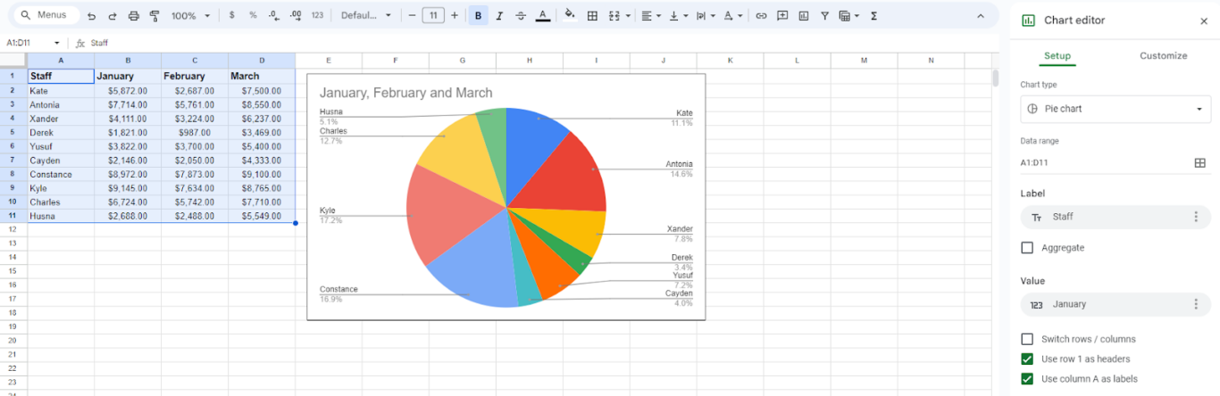
When viewing the data as a pie chart, it’s easy to see the percentage that each staff member contributed to the total amount of gross profit for the quarter. Kyle was the top performer at 17.2%, whereas Derek was the lowest performer, contributing to only 3.4% of the quarterly total.
Line Graph
Line graphs, also referred to as line charts, display trends in data. Here’s what a standard line graph looks like using data from our example across January, February, and March (we selected “switch rows/columns” to make it a bit easier to read).
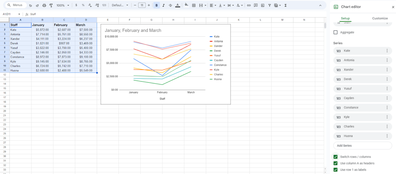
Now, you can easily see how each staff member’s sales fluctuated between months. Everyone took a dip in February but bounced back up in March to end Q1 with stronger sales.
Combo Chart
Combo charts use both column and line charts to show a different visual contrast with your data. This can be useful if you want to compare against a baseline.
Here’s what our original example looks like, with January sales as a baseline (displayed in the columns):
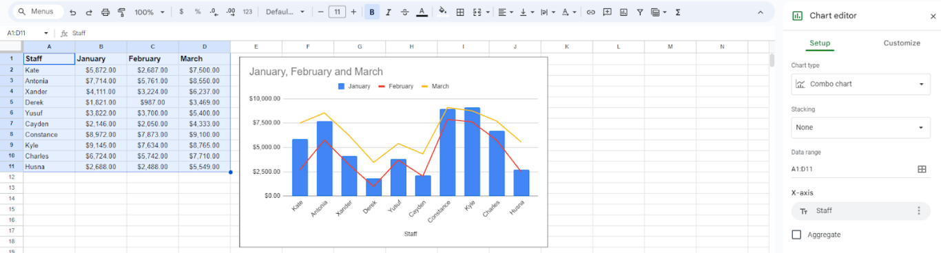
With this chart, it’s easy to see how sales fluctuate each month by staff member. February was lower across the board for everyone, whereas March was higher for most staff.
Combo charts are a great way to visualize multiple types of data over time. For example, you could easily compare gross profit against net revenue throughout a specific quarter.
Scatter Chart
Scatter charts are another popular option for plotting data points. Visually, it looks like dots literally scattered across your X- and Y-axis. Each dot sits where the data points on your axes meet.
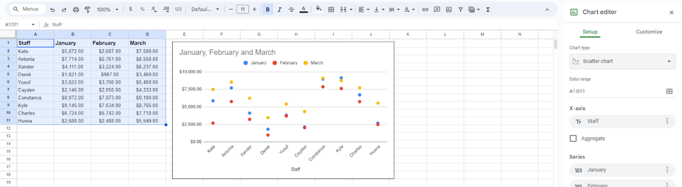
Our example isn’t a great visual representation as the dots are scattered quite a bit. Typically, scatter charts are used to highlight cluster patterns and identify outliers. If all your data points hover around the same spot, or if some are wildly out of place compared to the majority, what does that tell you? These charts are invaluable for identifying patterns and nonlinear trends.
To make all these charts and more, follow the three steps highlighted above. You can select different types of charts in step three: in the “Setup” menu under “Chart Type,” select which option you want.
There are more options we didn’t explore here, so take some time and get familiar with them on your own. If you’re looking at data that includes cities or countries, try out the Geo Chart. Or, if you’re measuring progress towards a goal, try the Waterfall Chart.
Once you get really comfortable, you can even pull data from other sheets to create charts or implement them in templates for larger projects.
How to create sparklines in Google Sheets
Want to have a visual representation of your data but don’t want to create a full chart? Sometimes you don’t have room to integrate a large diagram, which is fine: you can use sparklines instead.
Sparklines are small charts that fit inside a single cell within your sheet. They’re a great alternative if you want to showcase trends in data in a direct way without formatting an entire chart.
You can follow these steps to create sparklines in Google Sheets:
Step 1: Select the cell where you want to insert a sparkline
For this example, we’ll insert our sparkline in cell G2.
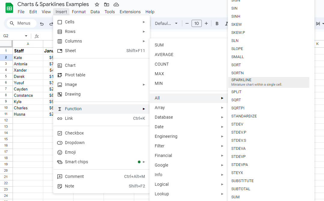
Step 2: Insert the sparkline
Click on the “Insert” tab in the top menu and hover over “Functions” – under “All” you will find the SPARKLINE option. You’ll also see here that it’s described as a “miniature chart within a single cell.”
Alternatively, you can start typing the formula for a sparkline in the cell where you want to insert it – =SPARKLINE – and then indicate your range and other specifications for formatting it.
Step 3: Customize your sparkline data
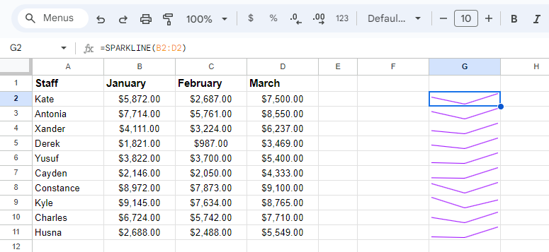
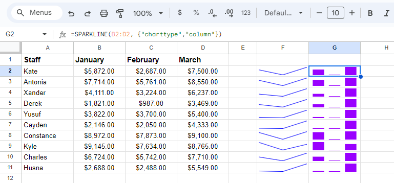
Once you select the sparkline function, it will appear in the cell you originally selected and prompt you to fill in the components to pull data from. In this example, we’ve specified cells B2:D2 so we can capture data from our team member Kate and see a snapshot of her sales from all three months. Once you’ve selected a cell range, hit enter and your sparkline will appear.
Here’s what ours looks like after we copied the same formula for all staff members:
Sparklines will default as line graphs, but you can customize them in different ways. If you want it to appear as a column graph, for example, you can specify that in the formula.
For our example above, to turn the line graph into a column graph you’d use the following formula: =SPARKLINE(B2:D2, {“charttype”,”column”})
Here you can see the same sparkline formatted as a column graph (we also customized the colors by highlighting the cells and selecting new text colors in the top menu).
There are a few different customizations you can play around with for sparklines, so take some time to explore the options and see what suits your needs.
Now that you know how to create charts and sparklines in Google Sheets you can use them for reports, in presentations, or to break down trends for team meetings. Analyzing data just got so much easier!