The Office as a Product: How We Built Our Office for the Modern Workplace
This article was written by Andrea Ramirez Manzano, an Employee Success specialist at Unito. She managed the construction of Unito’s new offices in the middle of a pandemic, and that’s what she’s writing about here.
Like most businesses, we were struggling with the uncertainty of the pandemic at the beginning of 2020. That meant navigating the challenges this brought to our staff and to our company, as most people around the world were.
But we were faced with a big, unique challenge. Towards the end of 2019, we had started looking at spaces for a new office to house our growing team. As remote work became the new normal, we had to take a step back and reflect on whether we wanted to proceed with the new office.
We made the conscious decision to invest in our new office, even as many companies were going fully remote. That’s because we believe community and in-person interactions breed creativity and belonging. We also wanted to give our staff the flexibility to work where they are most productive. This led us to completely rethink our office plan and design a space that is catered to the modern workplace.
Building the new office: our process
We had the old office as a starting point, so we knew what worked, what didn’t, and needed to change. We tried to incorporate our staff’s feedback as much as possible and solve a maximum of pain points — just like when we’re building Unito.
Every detail was thoroughly discussed and thought through. We started with a basic list of “Must Haves” and “Nice to Haves” that quickly evolved into a more holistic view of our office experience and how we wanted to approach the design process.
It’s easy to fall into the trap of picking out colors or debating the exact number of meeting rooms without first taking a step back and asking what we want the space to do for us.
Here is a example of one of the journeys we mapped with the office experience we had and how we wanted to improve it:
Experience: Coming in and out of office
- Arriving from/going to the gym: “I have a big bag with me, and it could be smelly.”
- Arriving by bike or running: “I have equipment, I need to change.”
- Arriving in the winter: “I have dirty boots to change out of, don’t want to get the office dirty.”
These are just a few examples, but hopefully helps you get the idea. Based on this experience we made decisions on the way the entrance and coat room were designed.
How to treat the office as a product
In broader terms, we’ve taken an approach of treating our office as a product and our employees as clients, to whom we want to give the best possible experience depending on what they are looking to get out of the office.
We started by drafting the user journey for each of the use cases and came up with three different personas:
- The 100% in-office goer: The part of our staff whose primary workplace is the office and they come in 4-5 per week.
- The occasional office goer: Team members who value the flexibility of hybrid work and enjoy a balance between working at the office and at home.
- The non-frequent office goer: The part of our staff who prefers working from home and will only come to the office for a specific meeting or event.
Each of these personas need something different from the office, and their experience and expectations will be different. So as we approach the office as a product, here are some of the features we implemented to to try and give everyone the best experience and nurture community and collaboration
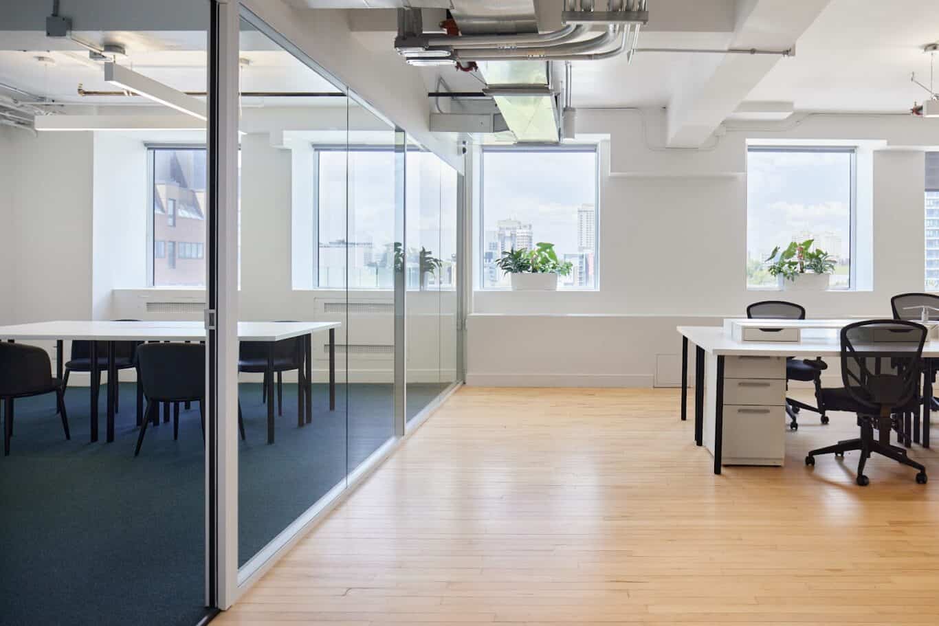
A bright and open working environment
Our fixed desk section is illuminated by natural light which gives a pleasant space for the frequent office goers. This is something we experienced at our old office, where the prime real estate was by the windows, and some people needed to compromise and sit down in the less optimal space. We tried to make sure we had enough space in the bright area so everyone could get a spot.
We also have the occasional night owls who prefer a darker setting, so we have some spaces with artificial light too.
Flexible seating areas and hang out spots
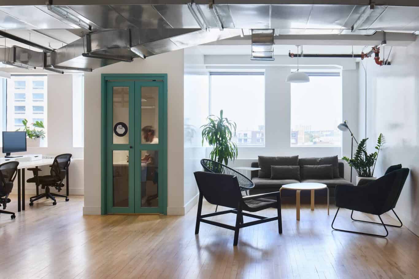
For occasional office goers to hang out before or after their meeting and for frequent office goers to switch up their workstation for the day.
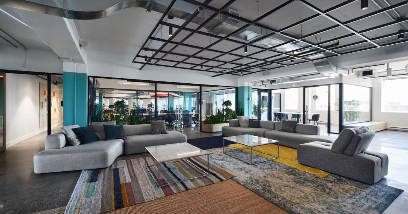
We have walls we can write on to create spaces for brainstorming and collaboration, comfy couches and different types of chairs.
These spaces are also great for the non-frequent office goers, who are not used to the office setup and are not sure where to sit for the time they are at the office. We’ve recently added lap desks to make the spaces more comfortable.
Spacious social areas to host community events and organize team building activities
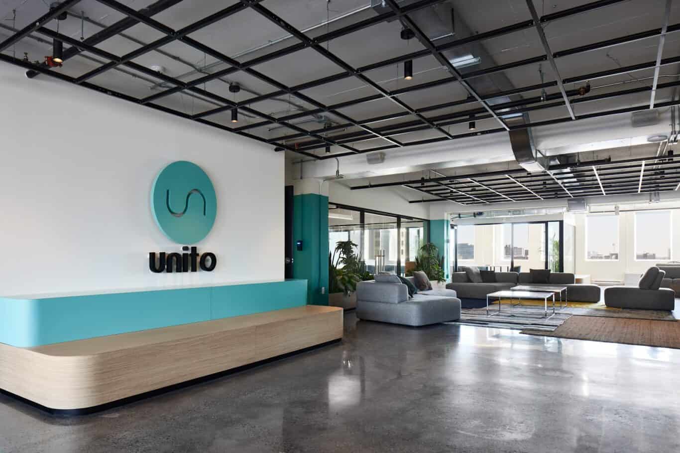
This was one of our priorities. We wanted to have a space designed to host events and open our doors to the Montreal tech community. It has an integrated sound and video system for talks and conferences, a fully equipped kitchen with a bar counter and enough space to comfortably organize food and drinks, as well as three full-size fridges.
The space can hold around 100 people. We’ve been lucky enough to have welcomed different organizations in the last two years such as Women in Tech, Montreal Typescript and Product Circle from APM Montreal.
Brainstorm and collaboration areas
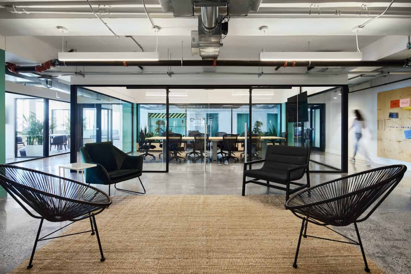
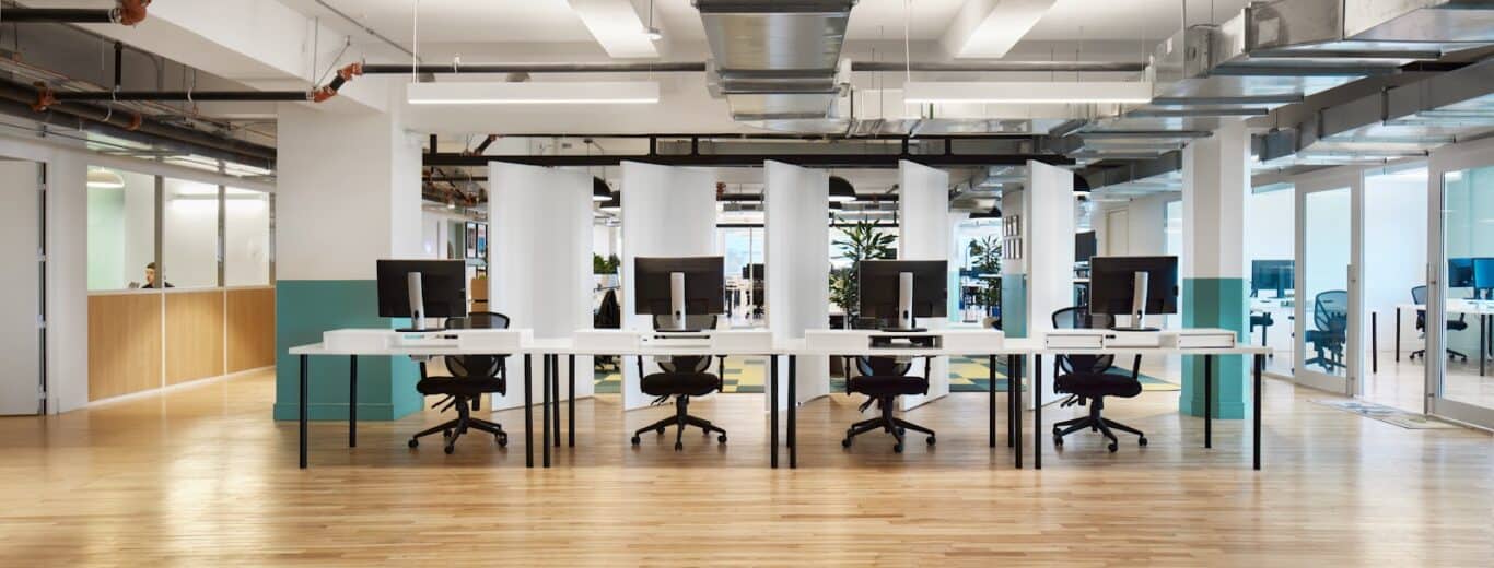
One of the main reasons our staff gets together is for brainstorming and live workshops. For this reason we designed and custom built two walls of rotating panels that act both as a space separator as well as a giant whiteboard.
In addition to that, all our meeting rooms have full wall whiteboards and glass walls for even more writing space.
Closed meeting rooms and memes, so many memes
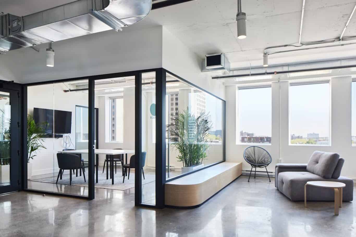
We don’t have any closed offices, not even for our executive team or CEO; we all work together in the open space. But we do have small meeting rooms for teams to get together. Most of our meetings nowadays are hybrid, so each meeting room has an integrated sound system and video conferencing to support hybrid meetings.
What about the memes? We LOVE memes and emojis, it’s rooted in the Unito culture and is part of our communication tools. All our meeting rooms are named after memes: The Party Parrot, Nyan Cat, Y tho and Forever alone.
Tips for future office managers or builders
Try to keep the space as flexible as possible.
We are constantly switching things up and adapting to the evolving needs of our teams. Since moving in, we’ve had the closet space modified, we’ve switched the desk configuration several times and have added new hanging out spaces. Avoid putting expensive built-ins or buying big furniture that will be hard to replace. Lots of companies offer renting services so you can test out furniture and switch it easily. For instance, all our plants are rented, that way we can add or remove and use them to divide spaces as they evolve.
Start with use cases and finish with aesthetics
The fun part about designing a new space is getting to pick the finishes and colors, but don’t get distracted from the bigger picture. Once you’ve decided what the space will do for you, you can worry about how it looks.
Get feedback from all stakeholders
Not everyone uses the space in the same way, and things that seem obvious to some will not be a top priority for others. As someone who doesn’t exercise frequently, I would have never considered the importance of a big enough bathroom to change into my work clothes, but I learned that by asking about other’s experiences.
It’s all about planning and organization
At Unito we live and breathe Asana, so that was easy to incorporate into the project. But if you are not currently working on project management, I couldn’t recommend it enough for this type of project. There are many things that need to be taken care of and you’ll need a well-thought-out system to avoid stuff from slipping through the cracks.

